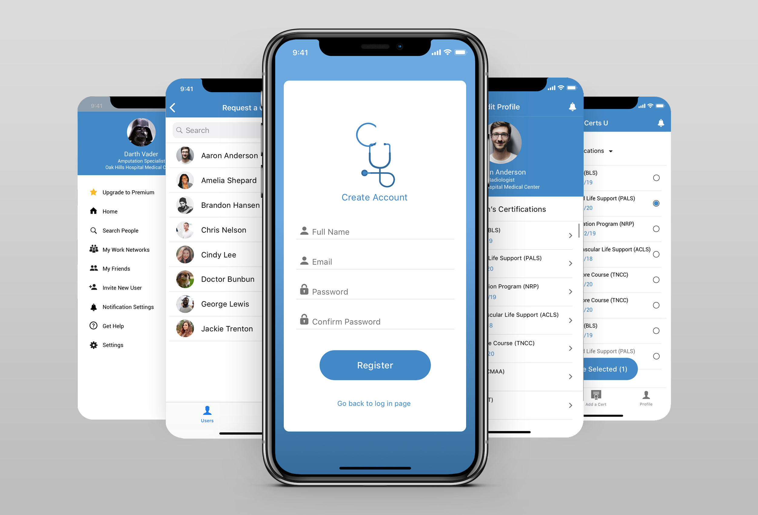
UX/UI Case Study: Certs U
Certs U is an app for managing medical certifications. It makes it easier for hospitals and employees to keep their certifications secure and up to date.
The Story / Challenges
I was approached by my client, a radiologist at an Oakland hospital, to help him design the interface for his app: Certs U. He’d gotten fed up with the lack of structure that hospitals had for managing their employee’s certs. There was no internal database, no reminders when it’s almost time to renew certs and employee’s must keep hard copies of their certs. He wanted to create a network database of certifications for each individual hospital and a system of management tools within the app to help the hospital run more smoothly.
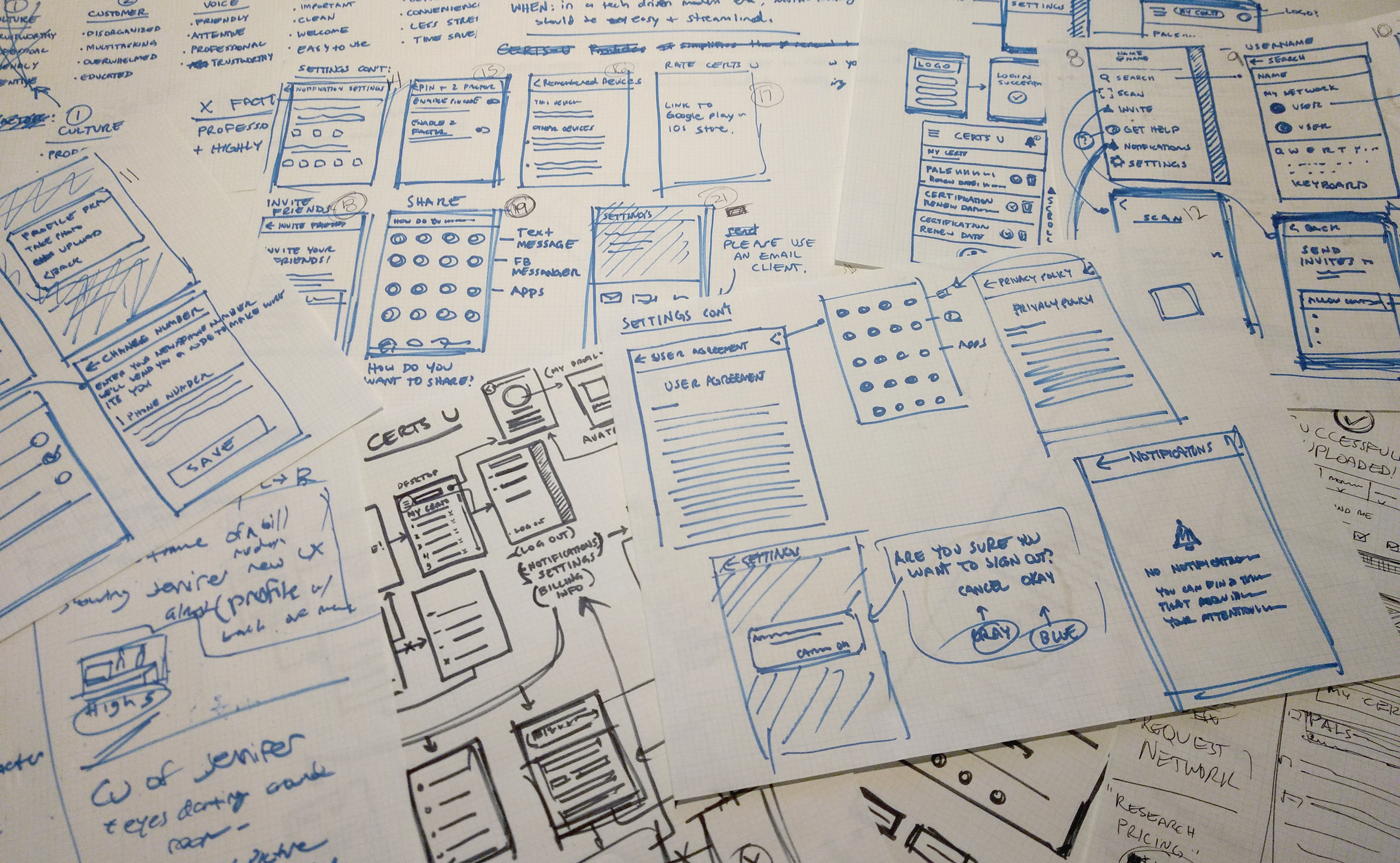
We didn’t have many insights to go off of when I first sat down to discuss the project so the early stages involved a lot of sketching and note taking – the goal of which was to help me and my client get an understanding of the scope of the project and break down the problem we were trying to solve with this app. Through this process we began to narrow down and prioritize features that were most beneficial to the user.
Once we had a good idea of our starting point we defined our goal as follows: To make life simpler for medical professionals by creating a tool that makes it extremely easy to keep medical certifications up to date, to make is simple to get certified in new skills and to make it simple for hospitals to organize and keep track of their staff’s certifications.
We also came up with a short list of project goals to keep in mind from the beginning of the project:
- The interface needs to be simple to learn and intuitive to use so that users are afforded a streamlined experience from day 1.
- The app needs serve the needs of medical facilities and also individual users.
- The app needs to be scalable over time and eventually be able to cover more than just medical certs.
Identifying Key Pain Points
During this process I learned that it can be quite a pain when a hospital wants to check an employee’s certifications. The manager has to contact the employee who then has to locate their paper certification, scan it and then mail or fax that copy back to the hospital. This happens on a regular basis and is unnecessarily difficult and annoying for the staff. If the employee can’t locate their cert or if it gets damaged they’ll have to jump through hoops to get new copies of the missing certification. If a certification is not renewed on time then that employee can’t work until they’ve renewed the cert and received a new copy. There is currently no database for tracking employee certs which can lead to mistakes or even just unnecessary hassle for people in the medical profession.
- With no singular database of employee certifications it’s a pain for hospitals to make sure their staff certs are up to date.
- It can be difficult to remember to sign up for classes and renew certifications on time.
- Without secure backup copies, people can find themselves temporarily out of work if they lose their certs due to disaster or negligence.
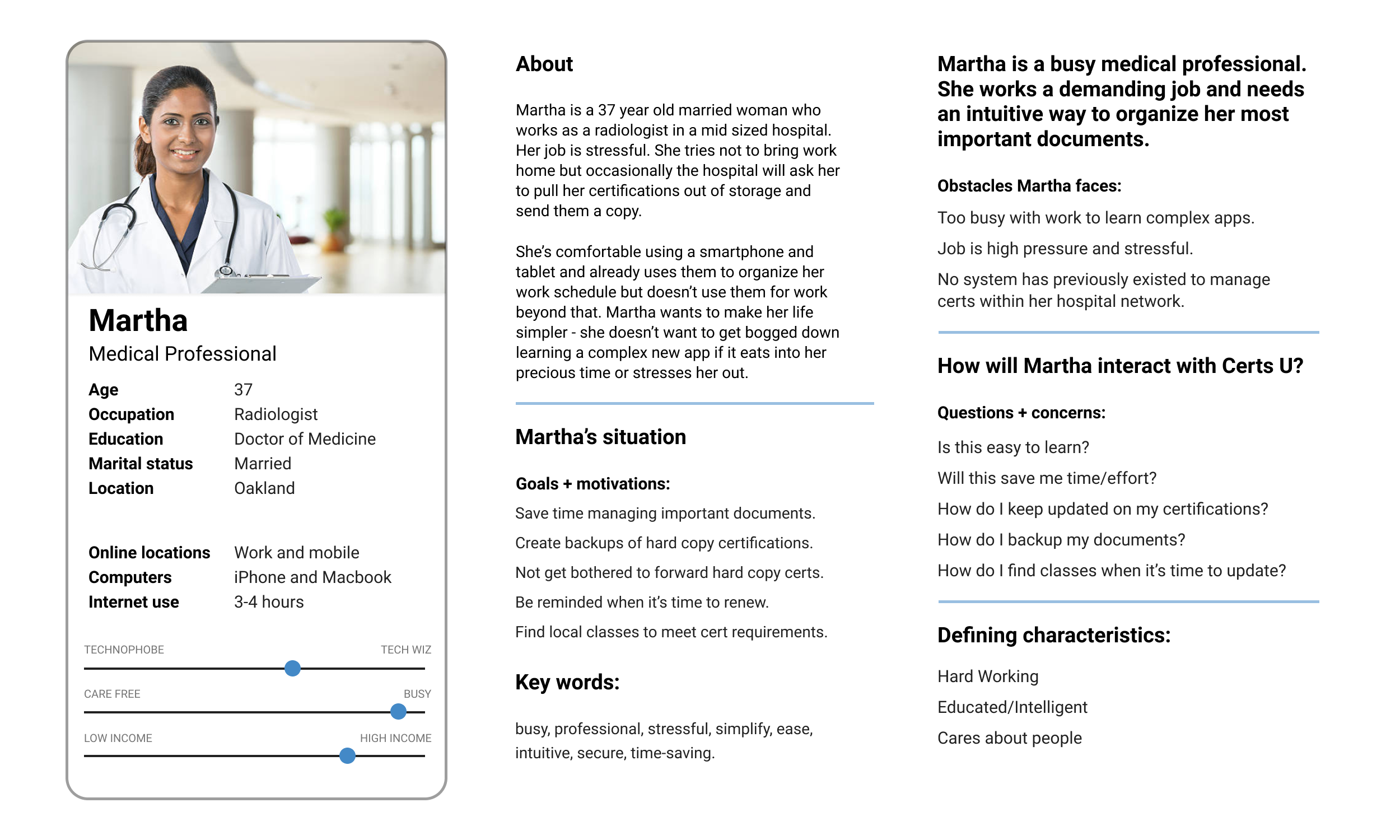
User Persona Studies
Throughout the development of our design we regularly spoke to members of the hospital staff – ranging from doctors, nurses and even directors to figure out how comfortable they are with technology, what problems they’ve had managing their certifications and what we should focus on to make sure that this app is a tool that would be beneficial to them. One of the things that became quickly apparent was that the app would need to be easy to adopt because there was a big gap between the tech savvy users and those who weren’t as comfortable with apps and smartphones.

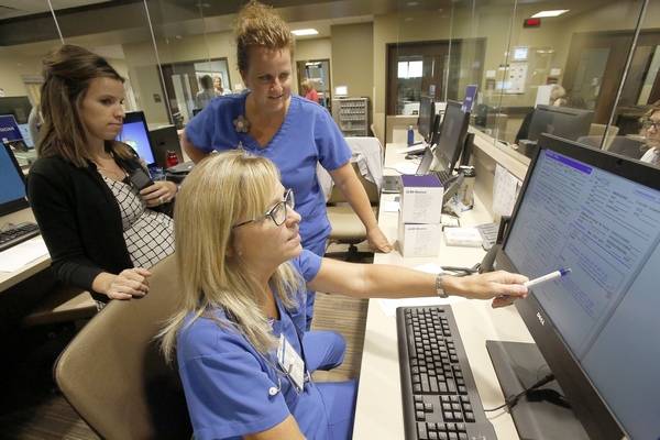

Persona A is an older medical professional, specialized in one area of expertise. He is often pressed for time and are not savvy with computers, phones, or apps – especially due to the high demands of his job. He has been at the hospital for more than 20 years and would need adoption and intuitiveness to be design priorities.
Persona B is a department manager at the hospital. Her focus is coordinating the health services of the hospital and supervising various departments. She is good with computers and decent with apps. She is in need of a simple way to organize and reduce her workload.
Persona C is a young medical professional in his first year of residency. As a millennial, he’s pretty tech savvy. As a newer resident, Persona C is regularly needing to get their certifications checked, add new ones and has not developed a system to keep track of his current certifications.
Color and Text
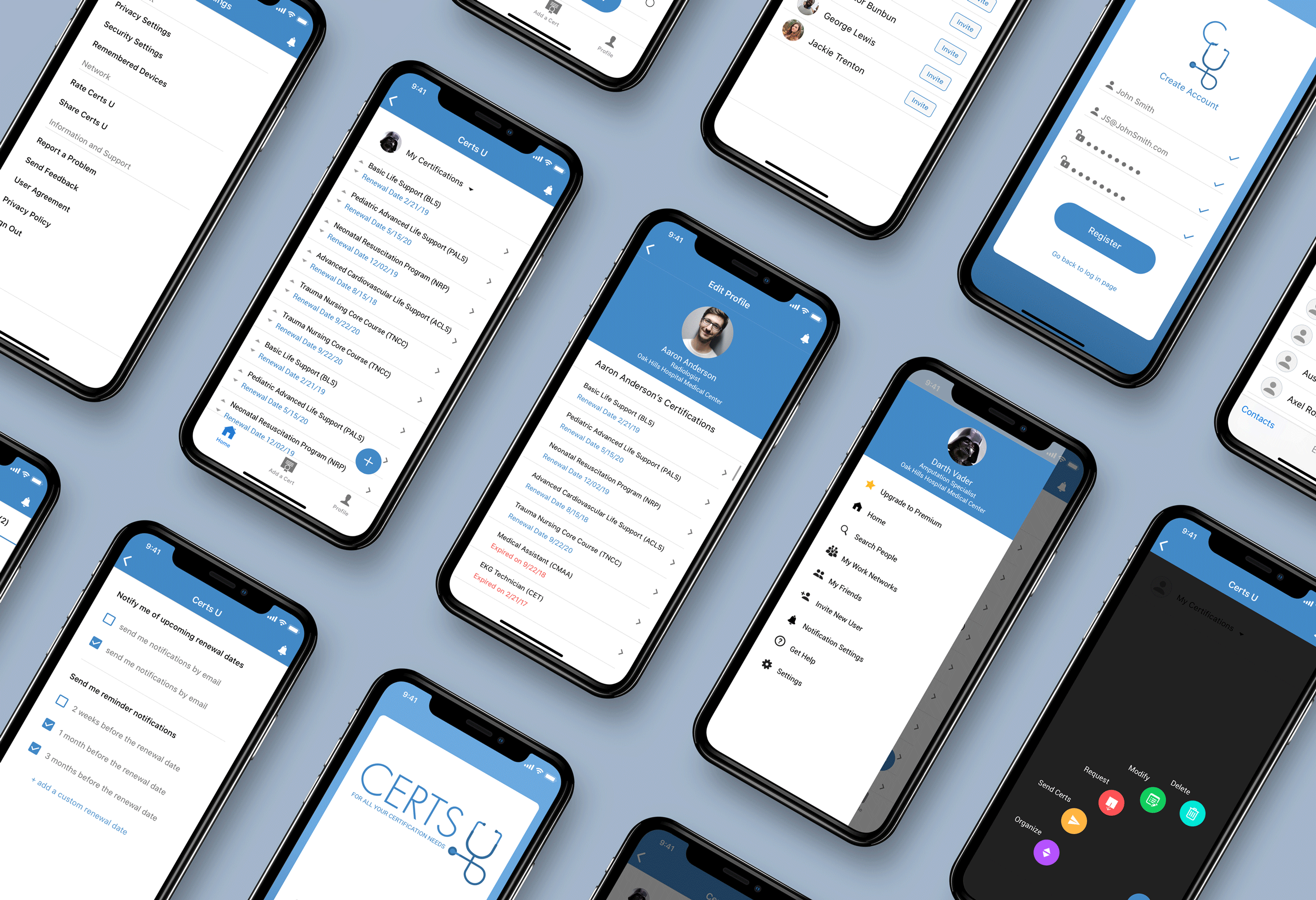
The app’s interface is primarily white with black and blue color punches. The goal was to design the interface to look simple, clean and legible. White was chosen because it felt appropriate for a hospital setting – it’s clean, professional and is more associated with hospitals then a ‘dark mode’ color scheme.
For text we used Roboto for Android and San Francisco for iOS because they are both tried and tested typefaces that work great on a bunch of devices.
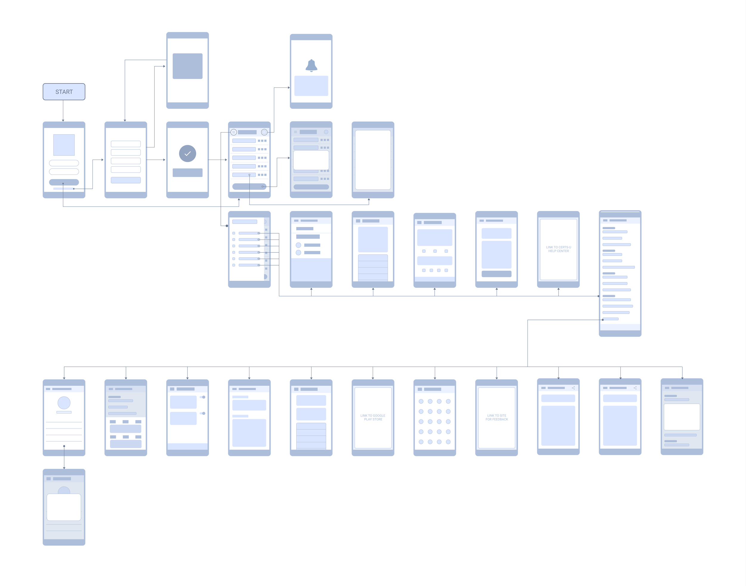
Mapping the UI Flow Chart
High Fidelity Designs
Next Steps
The app is currently being tested on it’s 2nd complete prototype for android and iOS. Once we’re ready to move past the testing stage the app will move into full development.

