Pandora “Collection” – UX Case Study
MY ROLE
Lead UX Designer
PLATFORMS
Android & iOS – Mobile / Tablet
INDUSTRY
Music Entertainment
THE CLIENT
Pandora is a well established music and podcast app with a focus on personalized radio stations. They have a loyal fanbase of listeners who use the app regularly to tap into their custom stations, listen to their favorite artists and who rely on the platform as the best place to discover new music & artists.
THE CHALLENGE
“Pandora wants to update their music app to meet the growing needs of their fans, especially as the music app ecosystem continues to evolve. How might we create an intuitive library for our users that preserves what they enjoy about the product while also making our features easier to discover and more intuitive to use.”
With the growing popularity of competing apps like Spotify, music platforms need to take the next step forward to meet the growing demands from users. Pandora’s UI has not been updated for quite some time and as a result some of it’s features have become buried. Even content offerings, like podcasts, are tucked away to the point where many users aren’t even aware they exist on the platform at all. What’s more, there isn’t enough real estate available to add new features in the library. I was challenged with taking over a redesign effort for their updated library called “My Collection” with the goal of having it developed for Pandora’s current beta product.
OBJECTIVES
- Improve understanding of how to navigate “My Collection”.
- Increase the use % of this section’s sub-menus (filters).
- Improve the speed for users locating and playing their content.
- Improve the user’s ability to locate and use specific features.
MEASURING SUCCESS
- Positive ratings from testers (score 1-5).
- Improved task completion speed in testing.
- Intuitive understanding of new IA structure.
- Overall positive feedback.
THE PROCESS
When I jumped on board this project, the prior “Version 1” iterations had already completed a few rounds of internal reviews but not much outside user testing. The internal folks had been asked to try using the product and then answer a regular survey where they could assign a score (rating) to each section of the beta design (ranging from 1-5). Our existing backlog of research and internal reviews served as my jumping off point for the project, but I felt it was important to take a step back to run through some valuable UX exercises to make sure our final deliverables would serve the needs of our users.

VERSION 1 – DESIGN AUDIT
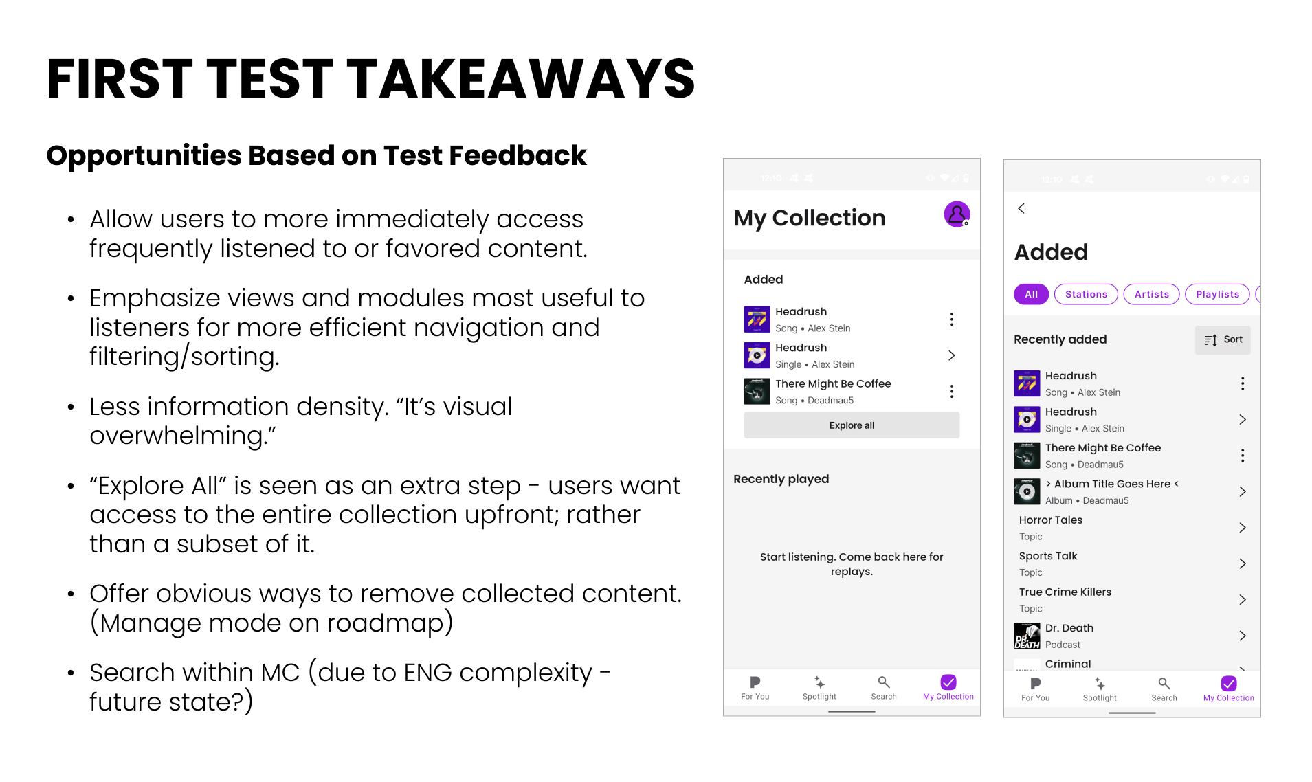
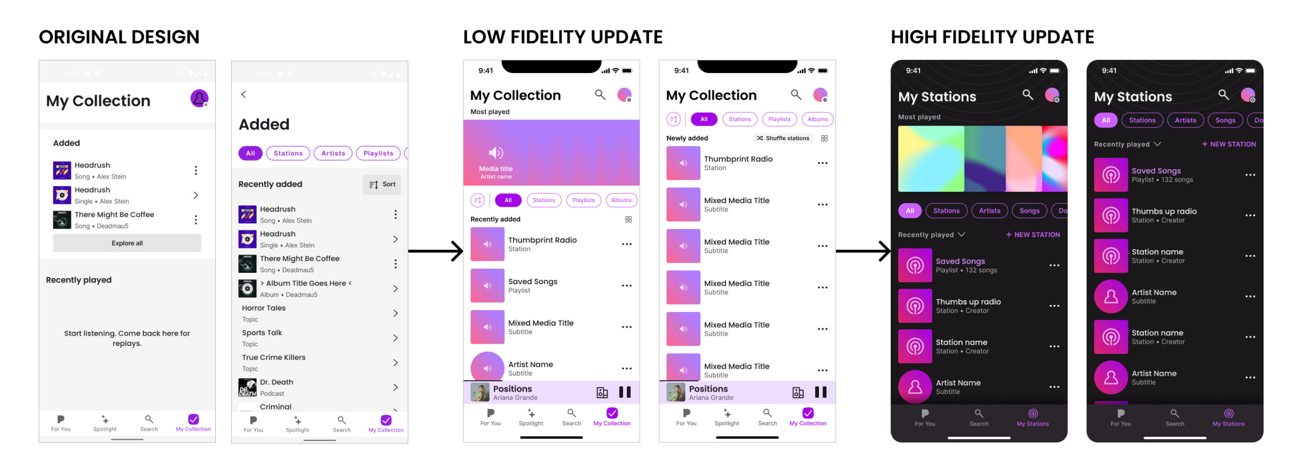
The version of “My Collection” that I inherited was divided into 2 sections. A “recently added” section made up the top half of the screen. It featured 3 pieces of content at a time and an “explore all” button that lead to the user’s complete content library. The bottom half of the page was dedicated to a “recently played” section to help the user pick up where they left off previously.
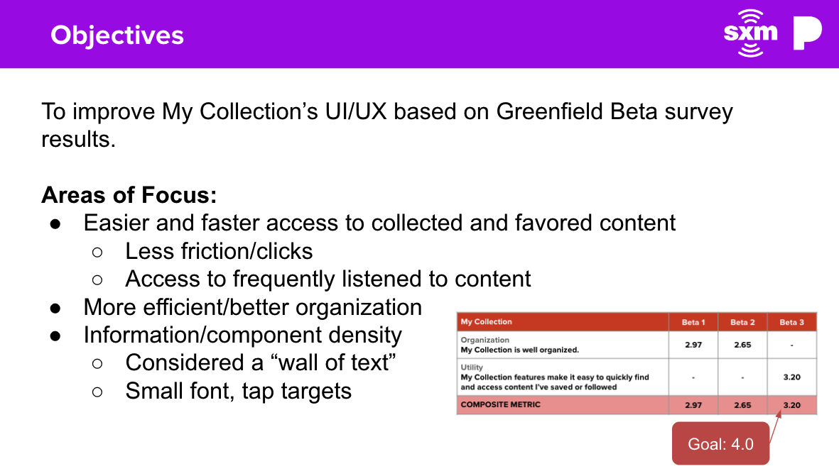
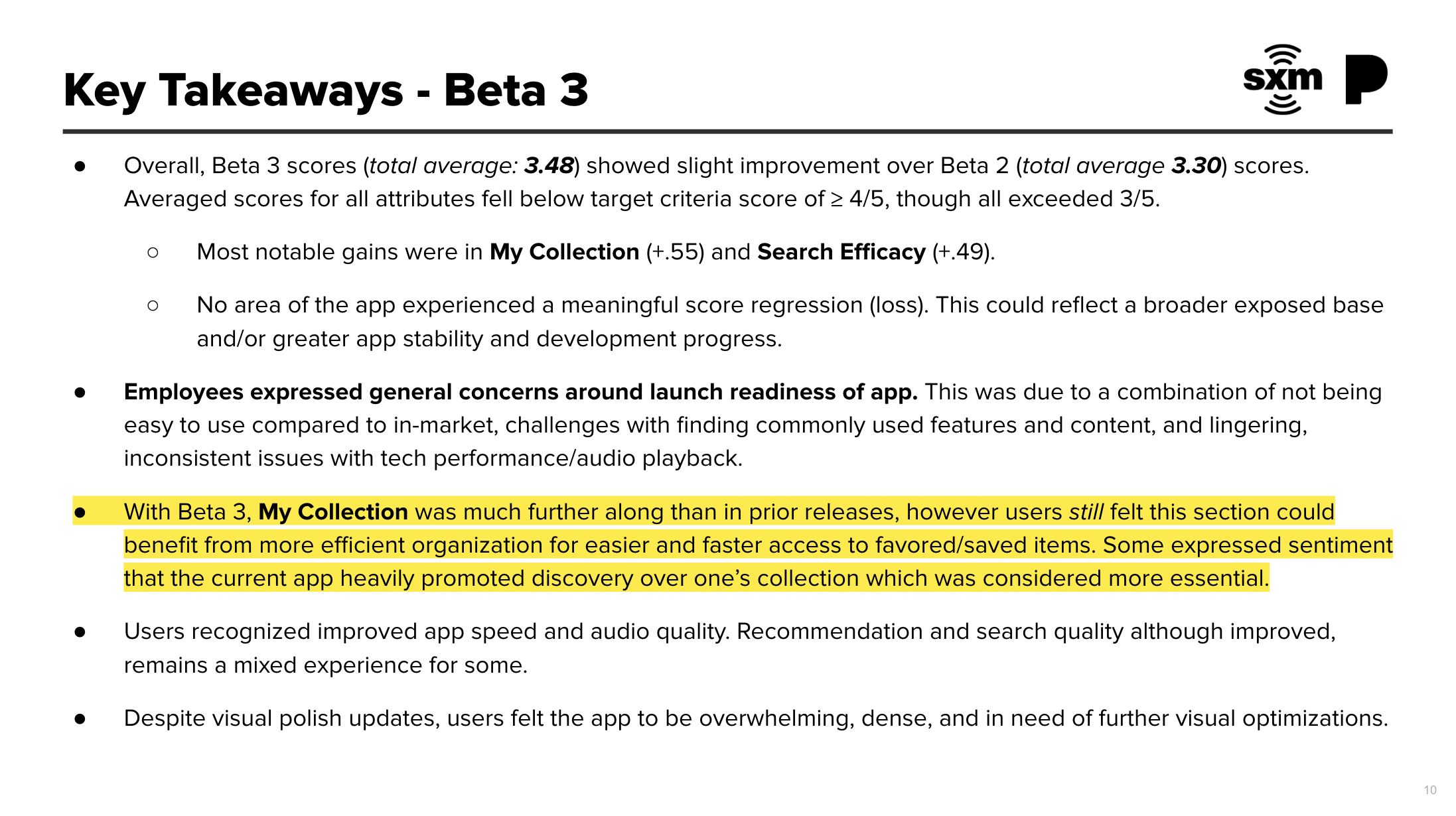
Overall, this design was not being very well received by testers, most rating it between a 2.5-3 out of 5. The reason for the lower ratings was primarily attributed to the “Explore All” button. Users hated the extra friction it added every time they wanted to access their entire library. The design was also a bit unfamiliar to users who, for the most part, didn’t have huge issues with the already existing library structure – it felt a bit like redesigning for its own sake.
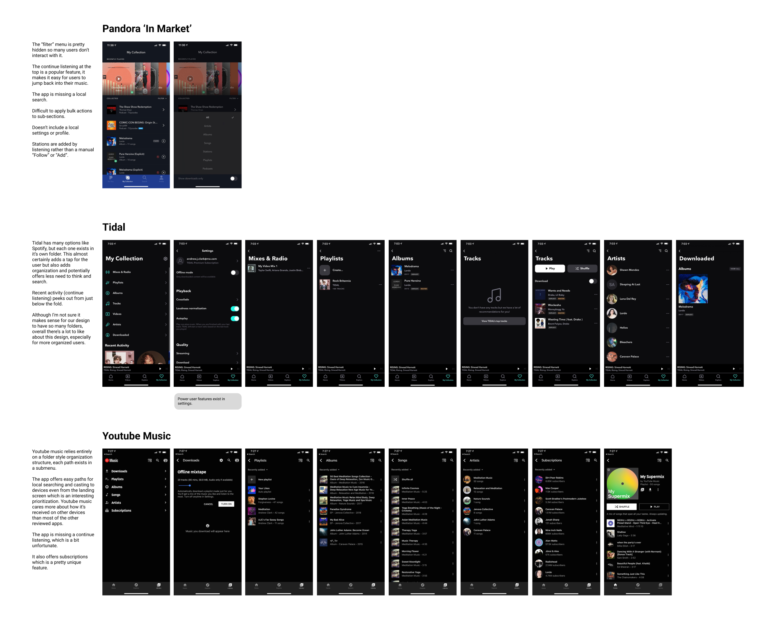
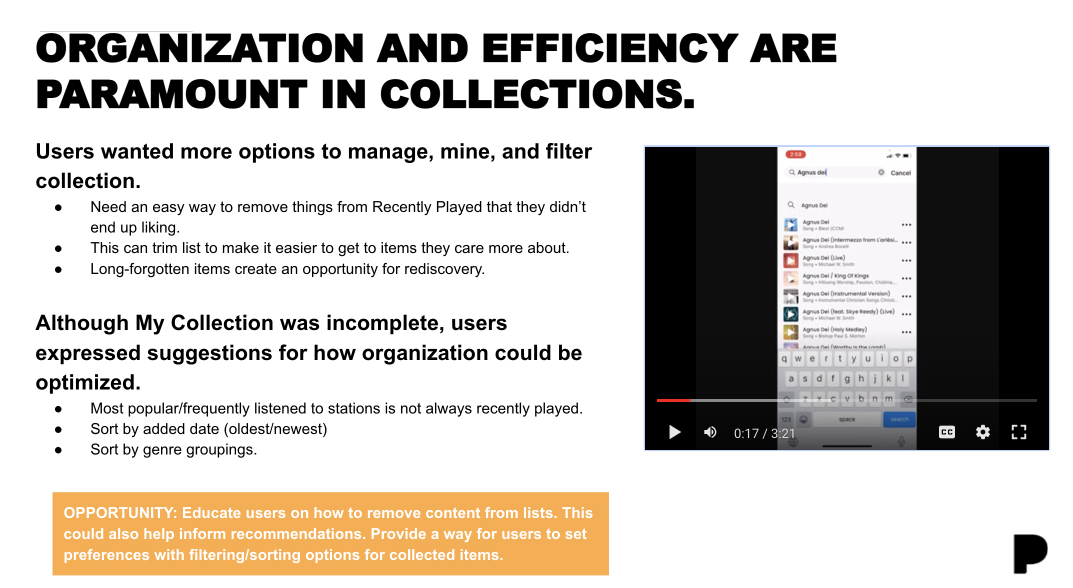
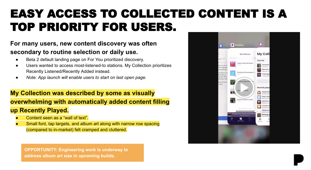
One of the first things I did was read through the research and feedback to better isolate user pain points and learn how people were using the product already (both “in market” and beta) so I could better understand what to preserve and what to update.
VERSION 1 – USERTESTING PAIN POINTS & COMPLAINTS
-
“The Explore All” button is annoying, I don’t like how it buries all my stuff.”
-
“Showing three things isn’t enough for me, I’ve got way more music than that. I want to see my library.”
-
“The design feels really gray and boring.”
-
“I wish I could search through my collection.”
-
“I miss the the original, just make that one more modern and intuitive.”
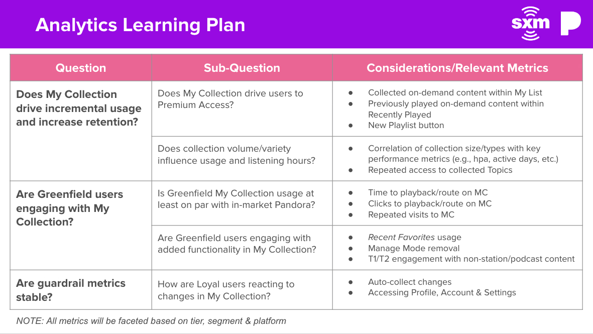
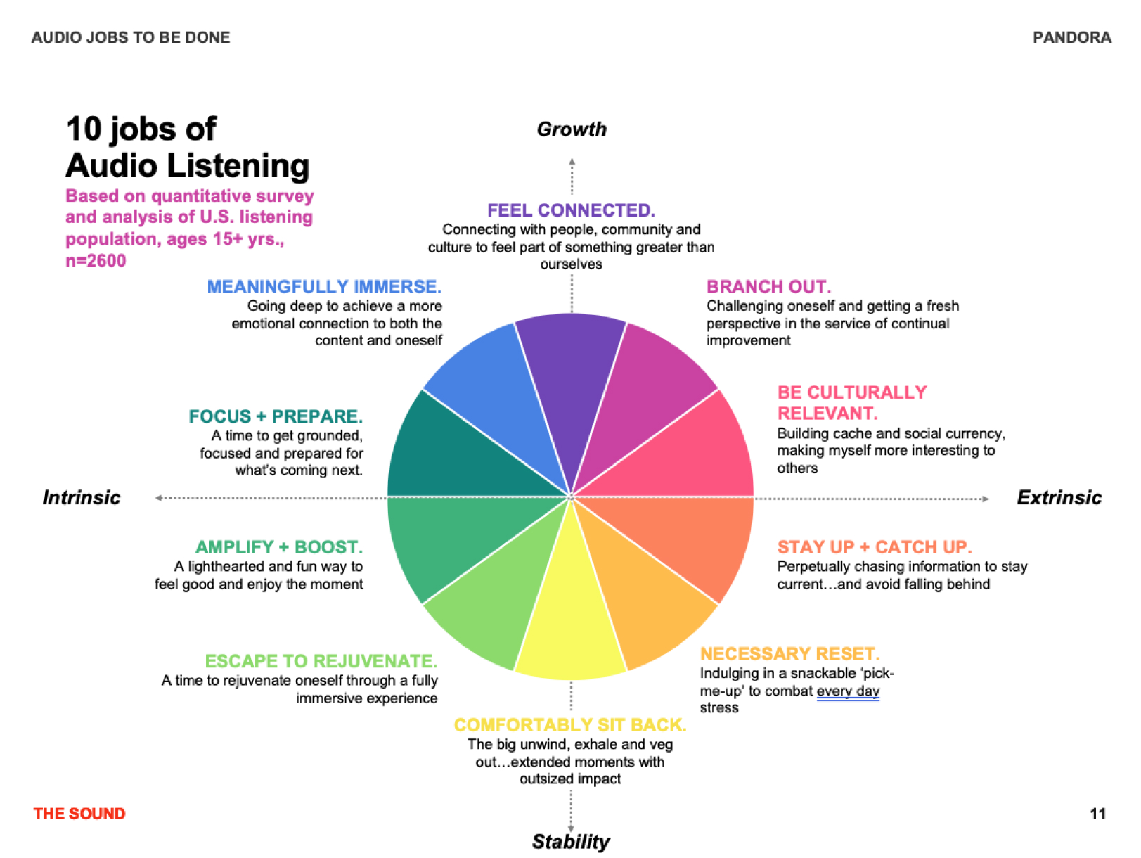
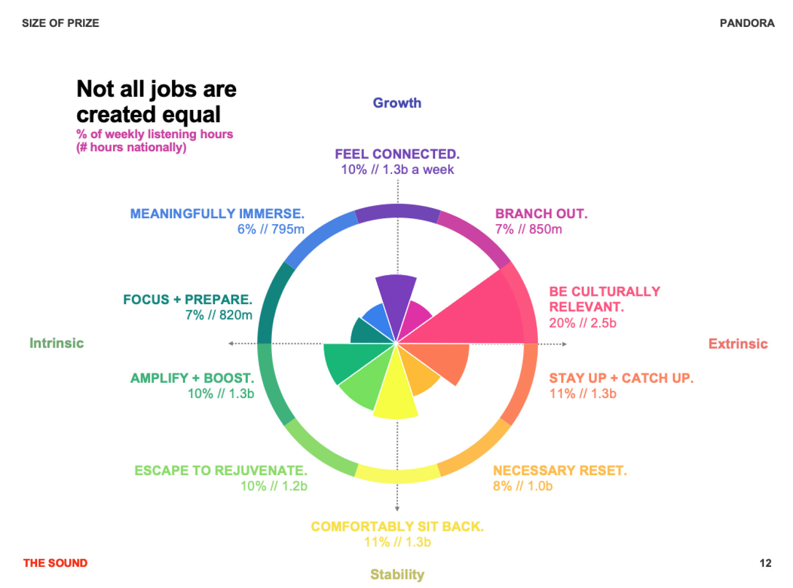
Early on, I spent a lot of time just reviewing the existing research and analytics. I also familiarized myself with tangential documents like the companies’ “jobs to be done” charts and of course, collaborating with my peers who were focusing on other parts of the app to make sure that our thinking was in alignment. I think it’s important to take the complete company ecosystem into account even when designing an isolated section of their product.
COMPETITOR ANALYSIS
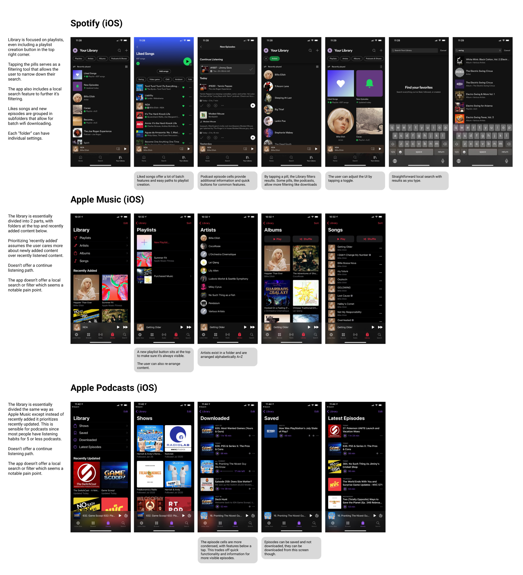
I always like to spend some time familiarizing myself with competing products to get a better understanding of how they feel, what I like and don’t like about them and what features they prioritize. This project was no exception, I refamiliarized myself with a variety of music/podcast apps, including our in market product. This step makes it so much easier to understand what users might expect to find in their music library, and helps me figure out where we might run into friction while iterating on designs.
APP FLOWS
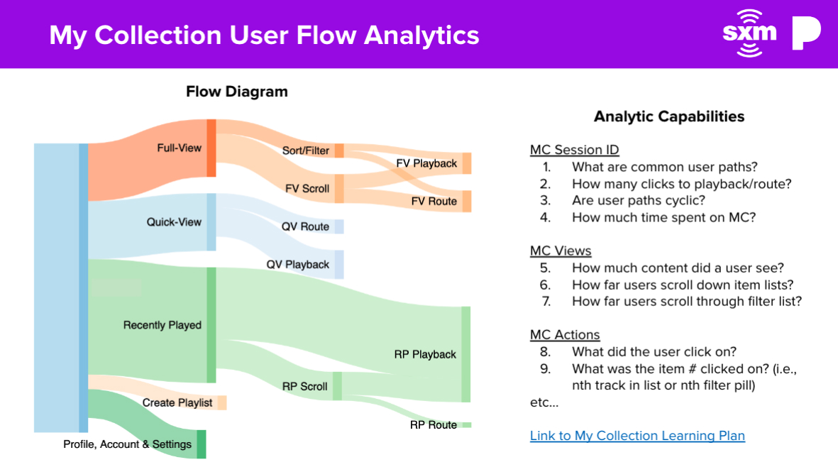
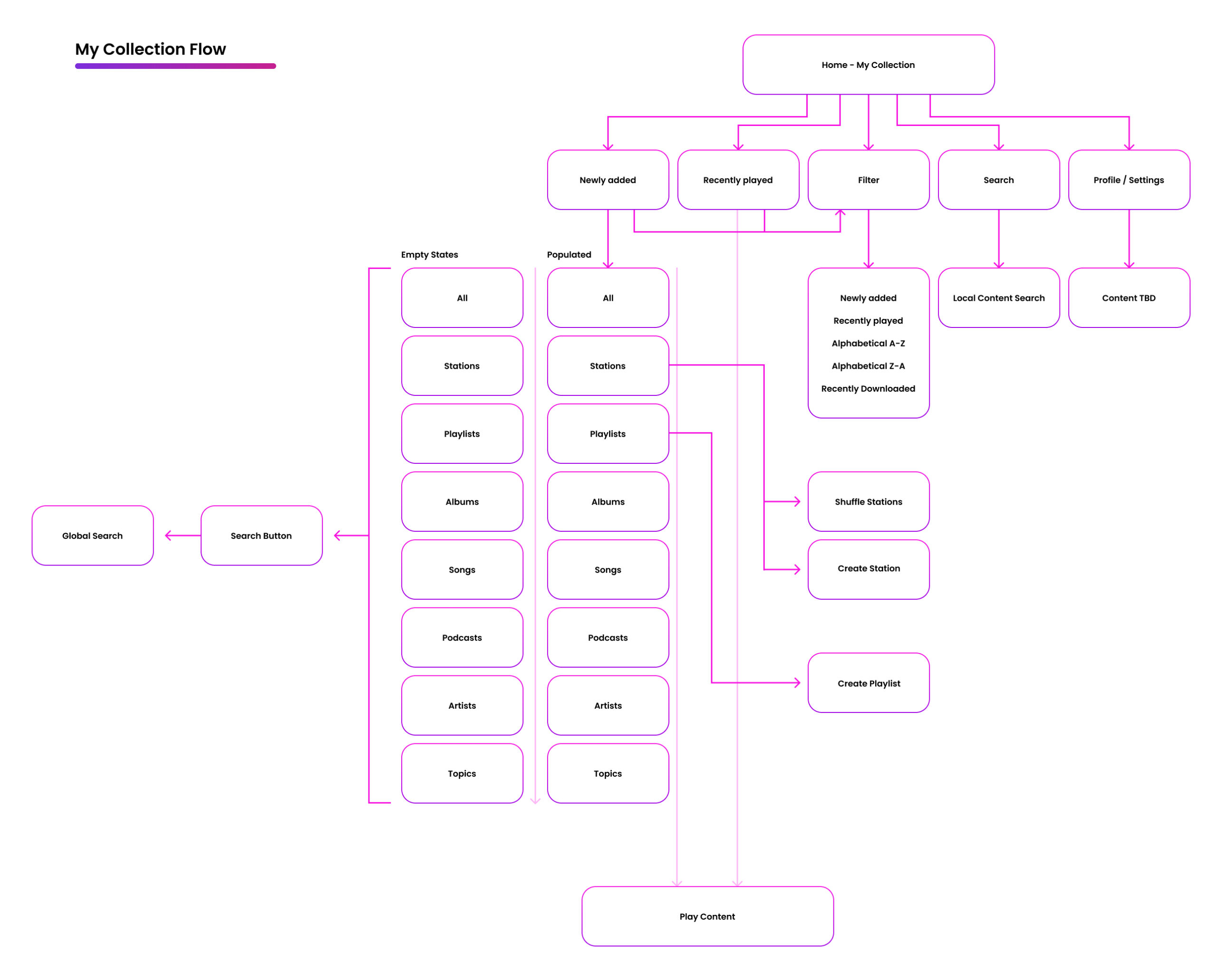
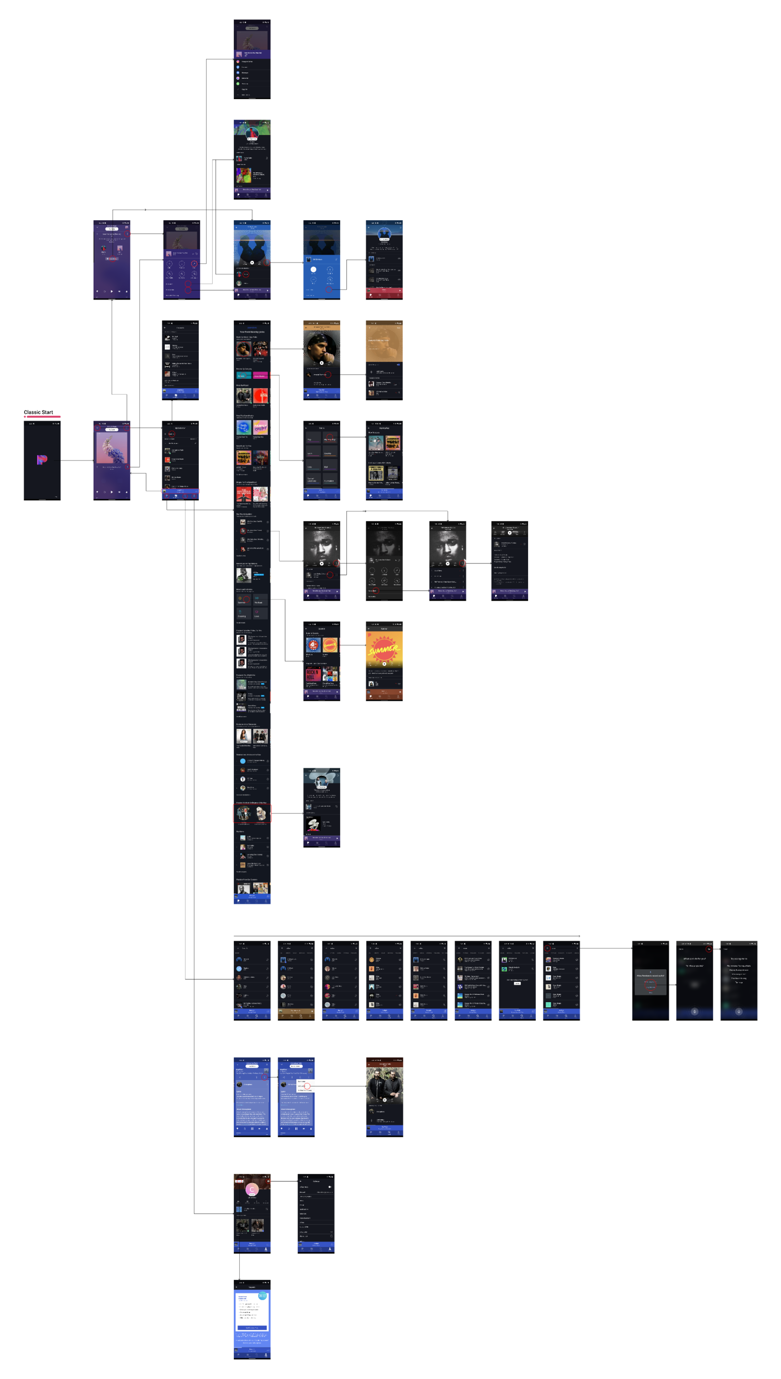
As a continuation of the competitor analysis exercise, I find it really valuable to study and become familiar with our own existing product – both the section being worked on and the broader app as a whole. To do this, I created app flows for the existing product and also leveraged some that co-workers had created. From there, I mocked up a simple diagram to help me visualize how the new “my collection” might fit together, and serve as a checklist for key screens and features.
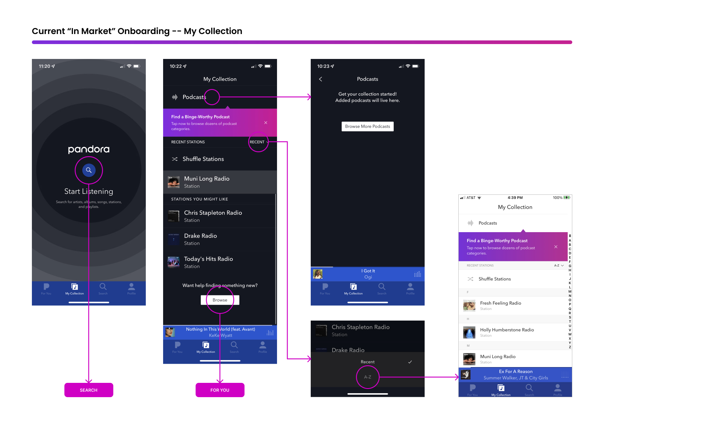
IN MARKET – ONBOARDING ‘COLLECTION’
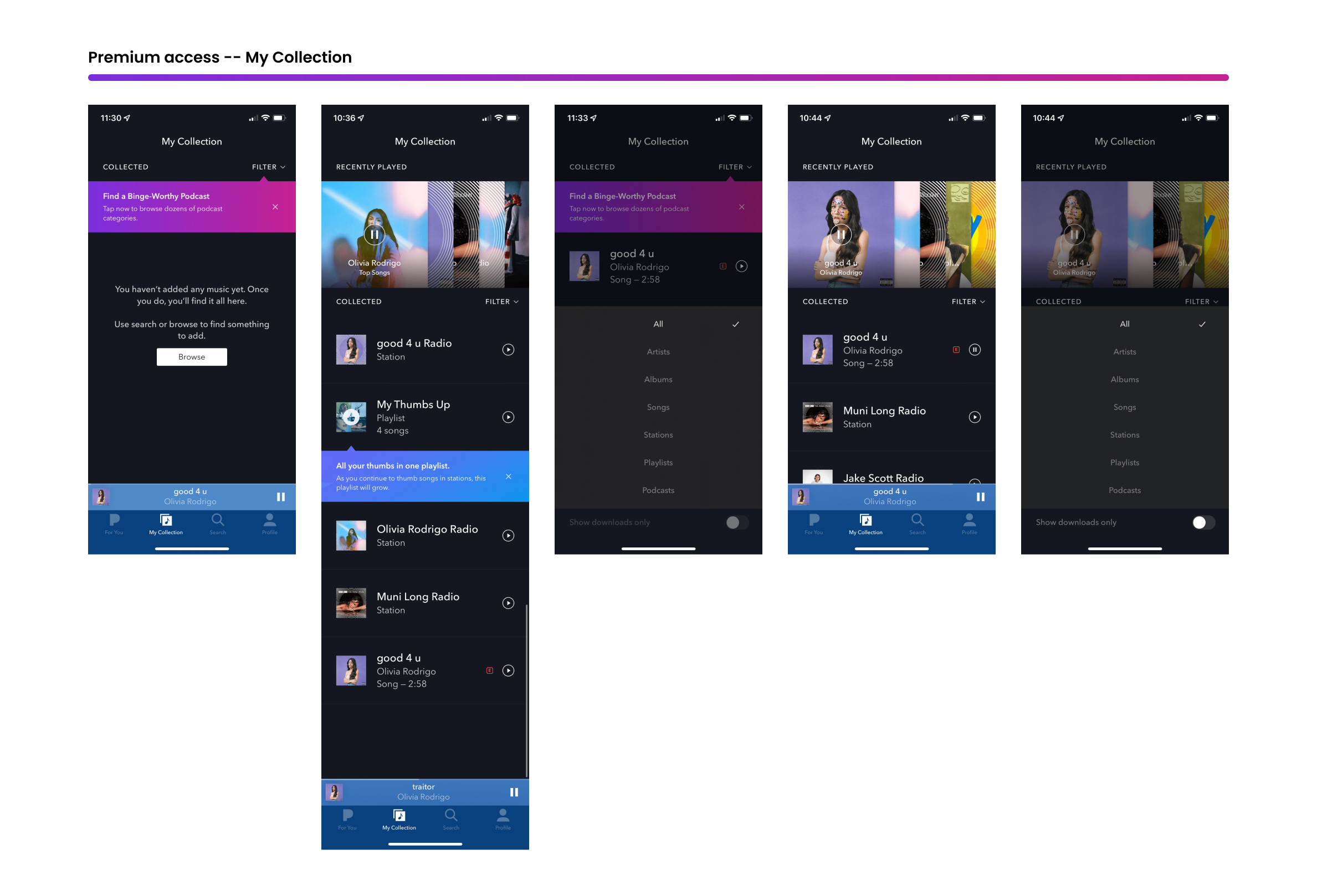
PREMIUM ACCESS COLLECTION
PROPOSED FLOW UPDATE
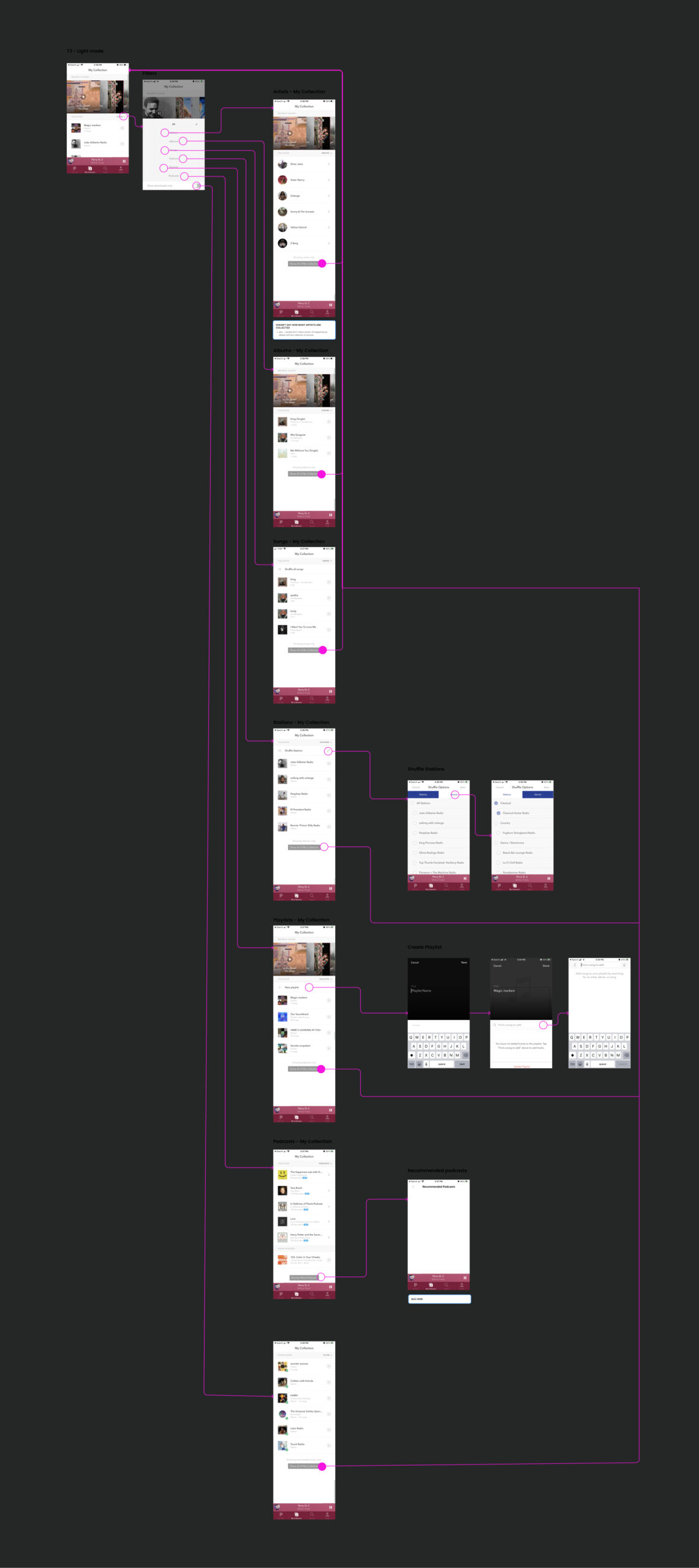
These more detailed (existing) app flows help me get a bird’e eye view of how the product fits together and serve as a great reference for teammates that don’t have time to familiarize themselves with the complete product flow & design. They can also be valuable tools for mapping user pain points as they come up during testing.
IN MARKET COMPLETE APP FLOW
IN MARKET “MY COLLECTION” FLOW
WIREFRAMES
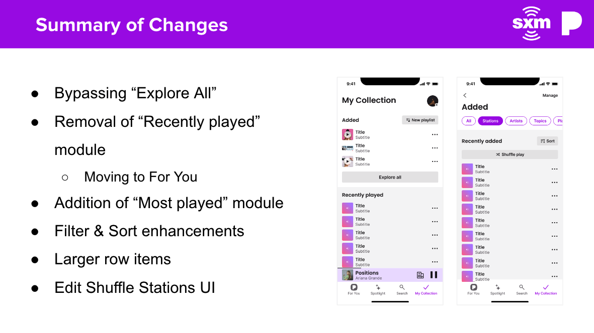
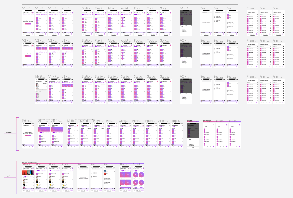
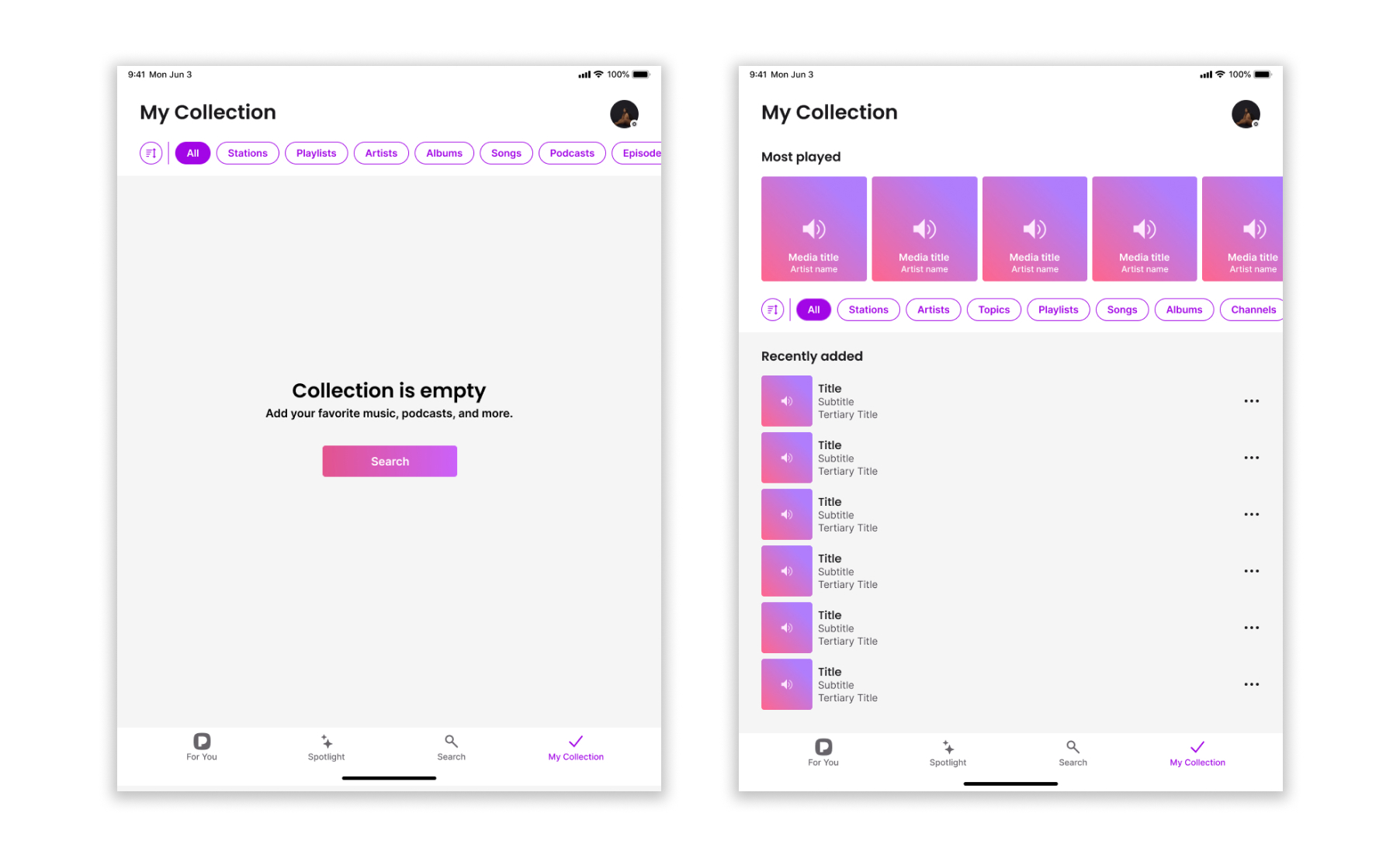
At this point in the project I was chomping at the bit and ready to delve into some focused design, after all, it’s my favorite part. I’d already played around with some design iterations to help get my thoughts in order but now I was ready to dive in completely so I could start gathering some more user feedback. These wireframes capture just a portion of the explorations I ran through during this ideation stage, but these would ultimately lead to the final shipped product.
WIREFRAME TESTING
I used the wireframes to create a prototype in Figma for internal testing and user testing. All the user feedback was captured in decks to share once per week with our team and with company leadership.
RESULTS
The updated designs were much more popular with our testers, and after a few rounds of iterations they were easily surpassing the 4.0 rating we were seeking. Our testers were quickly completing their test tasks and were able to learn the new structure with relative ease.
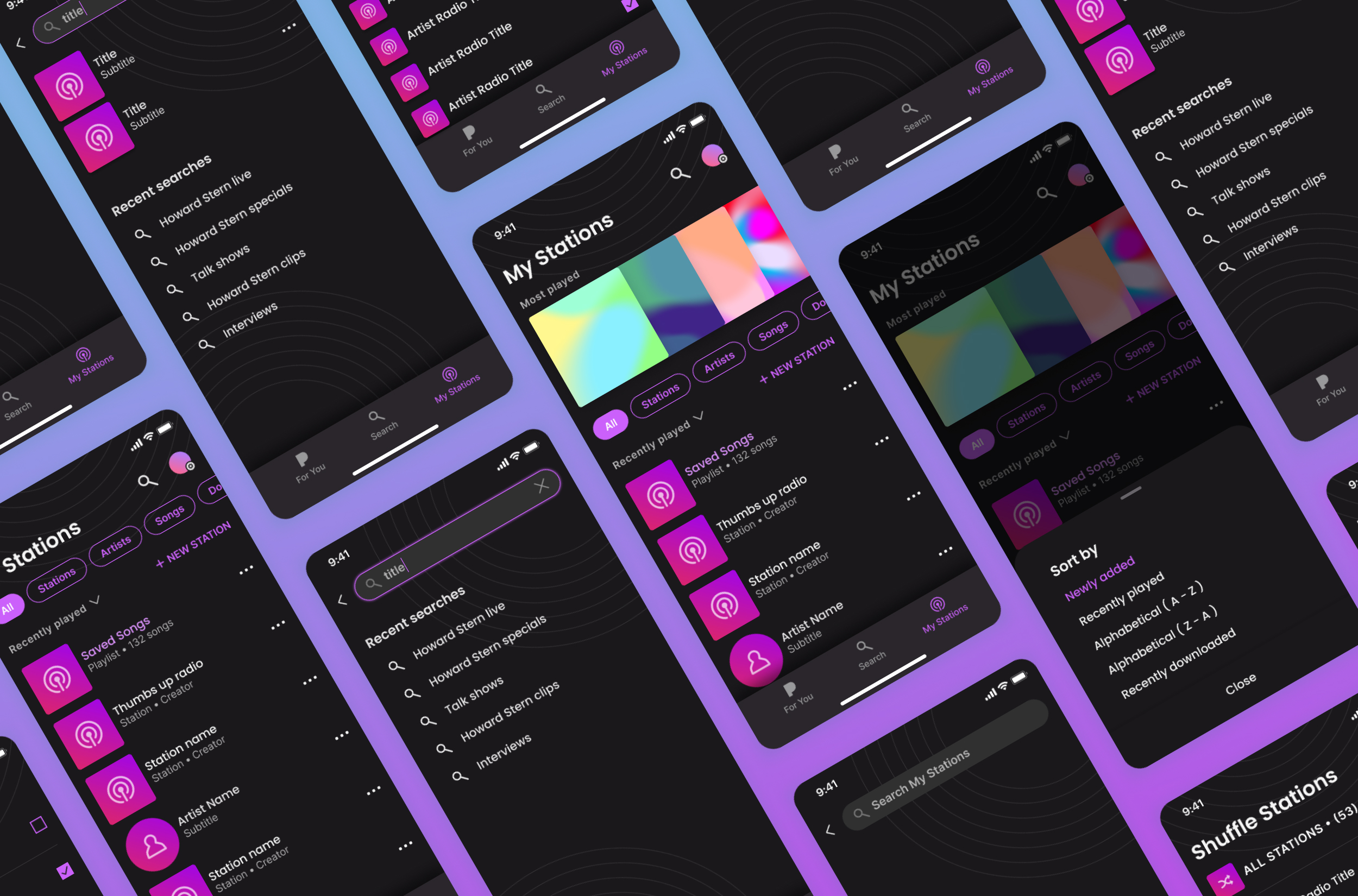
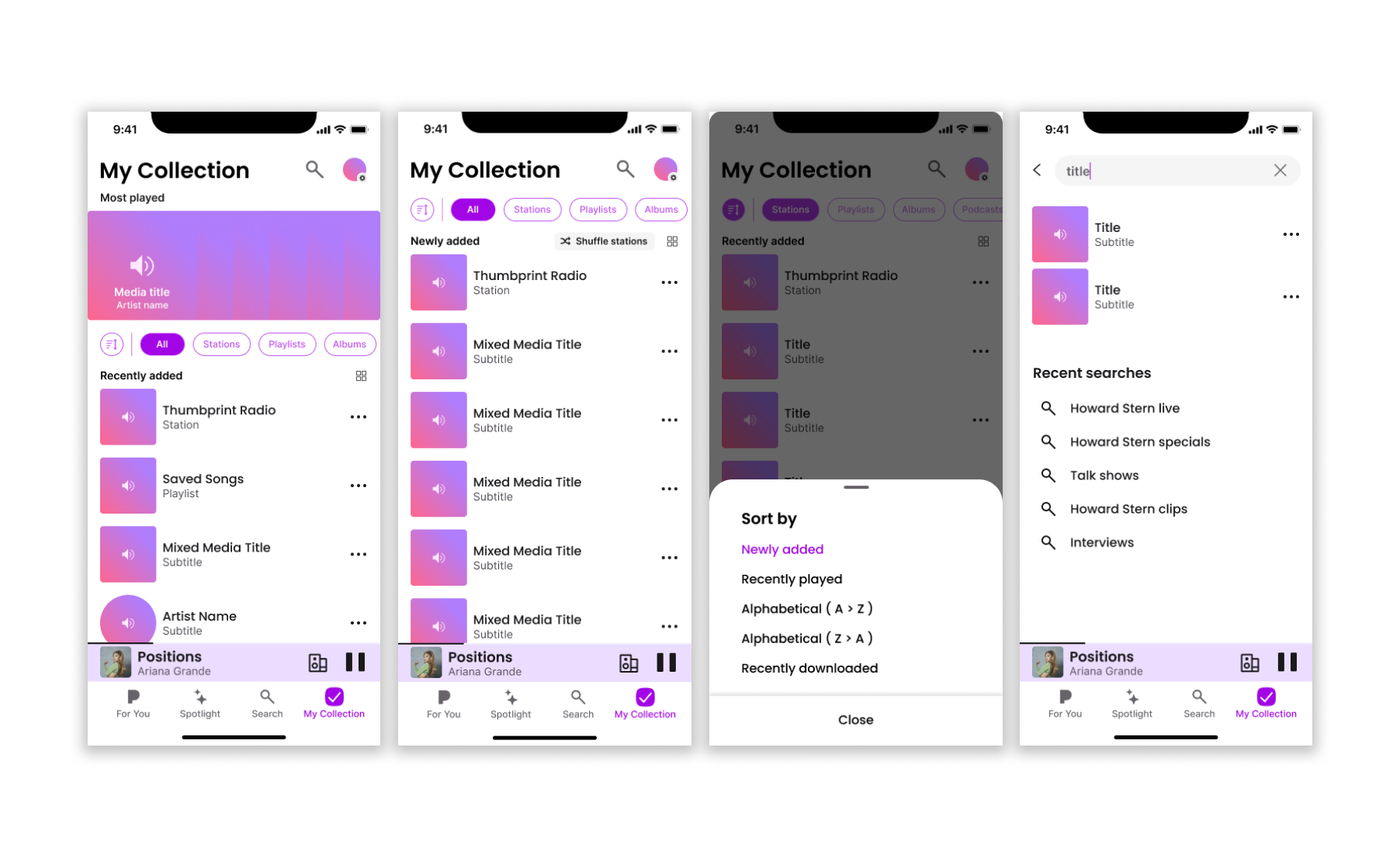
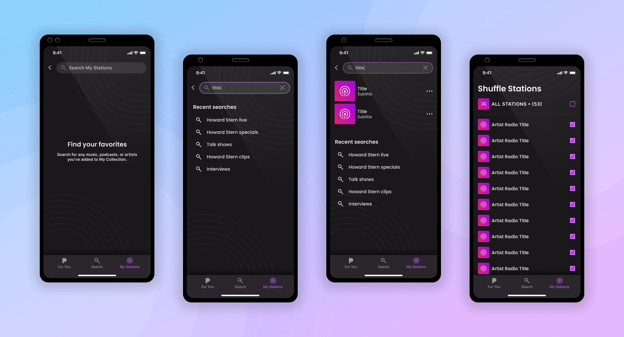
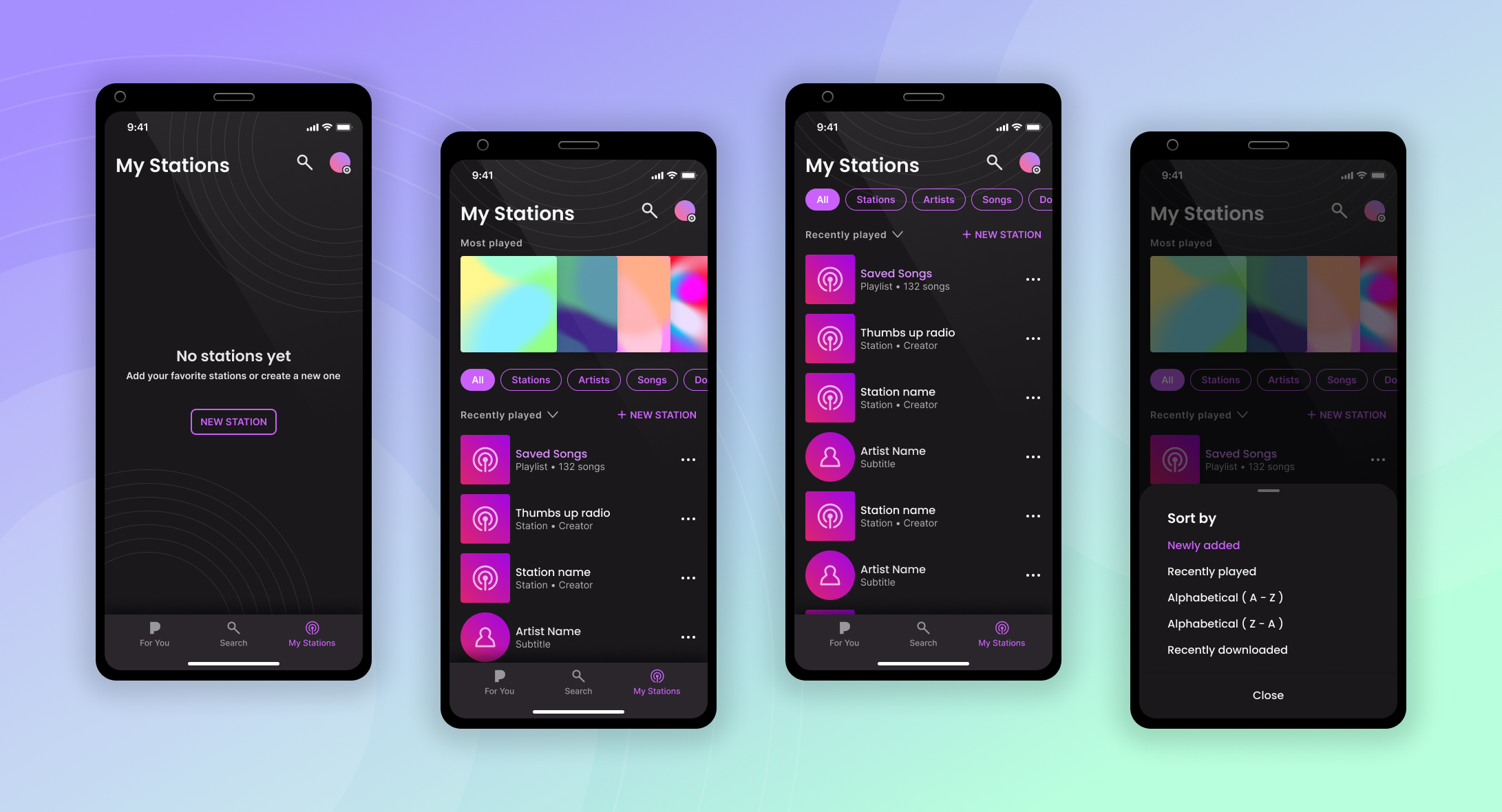
HIGH FIDELITY DESIGNS
All the positive feedback from our testing sprints gave me confidence to move ahead with some high fidelity mocks and prototypes. These were used for the final rounds of testing and, once validated, were handed off to our engineering team for development.

