Stitcher – UX Case Study
Dedicated fans. Original Podcasts. A Deep Brand History.
Stitcher is an award winning and beloved podcast app. Founded in 2008, it is considered one of the original podcast apps. Stitcher has a long standing, loyal fanbase of podcast obsessed fans who regularly listen to their deep catalogue of podcasts and original content.
My Role:
Lead UX Designer and Researcher
Platforms:
Android & iOS Mobile, Tablet and Web
Industry:
Podcasts & Radio
The Story of Stitcher X
When I joined Stitcher, the app was growing outdated and was long overdue for a revamp. Users had been complaining about a multitude of issues for awhile and the app’s ratings were suffering. However, it’s older/complicated backend made it challenging to adjust the frontend without causing nasty crashes and bugs. At the start of this project, I’d been with the company for a couple months, getting our research program rolling and collaborating on UX updates for the in-market app. During this time, in an effort to explore new ideas without constraints, we’d formed a small cross-functional team with the goal of workshopping and collaborating on exciting redesign ideas. Our “brainz” workshops resulted in fun and interesting potential solutions to long standing problems with our products. It was a really exciting time to just play with design and collaborate together; it really energized the team. These brainstorms were not just about making something different, we were also iterating with one another and expressing a group desire to really connect with our fanbase and create something awesome for them. We began pushing for a more empathetic, human centered approach to our entire product design philosophy. From these workshops, we created and demo’d a prototype to our broader company and leadership, it was so well received that a bold decision was made to divert all efforts to the creation of project: “Stitcher X”.
“Stitcher X” was to be a complete redesign of the Stitcher app and website, on both the backend and the frontend, with the goal of creating a powerful and intuitive experience for our users. In addition, the project sought to enshrine better philosophies in the companies’ values. Values such as: taking extreme ownership, working lean and cross-functionally, exploring interesting and innovative ideas, iterating constantly with no fear of failure while having a willingness to “kill your darlings” and always putting the user first.

The Challenge
Our primary goal from the outset was to design an overall better experience for our users across all interfaces. Doing so meant we needed to start having regular conversations with real people so we could figure out their pain points and delights, what to prioritize, what to remove from the product and what should be preserved. At the same time, we sought to create a backend and a design system that would allow our company to be successful in future iterations and improvements.
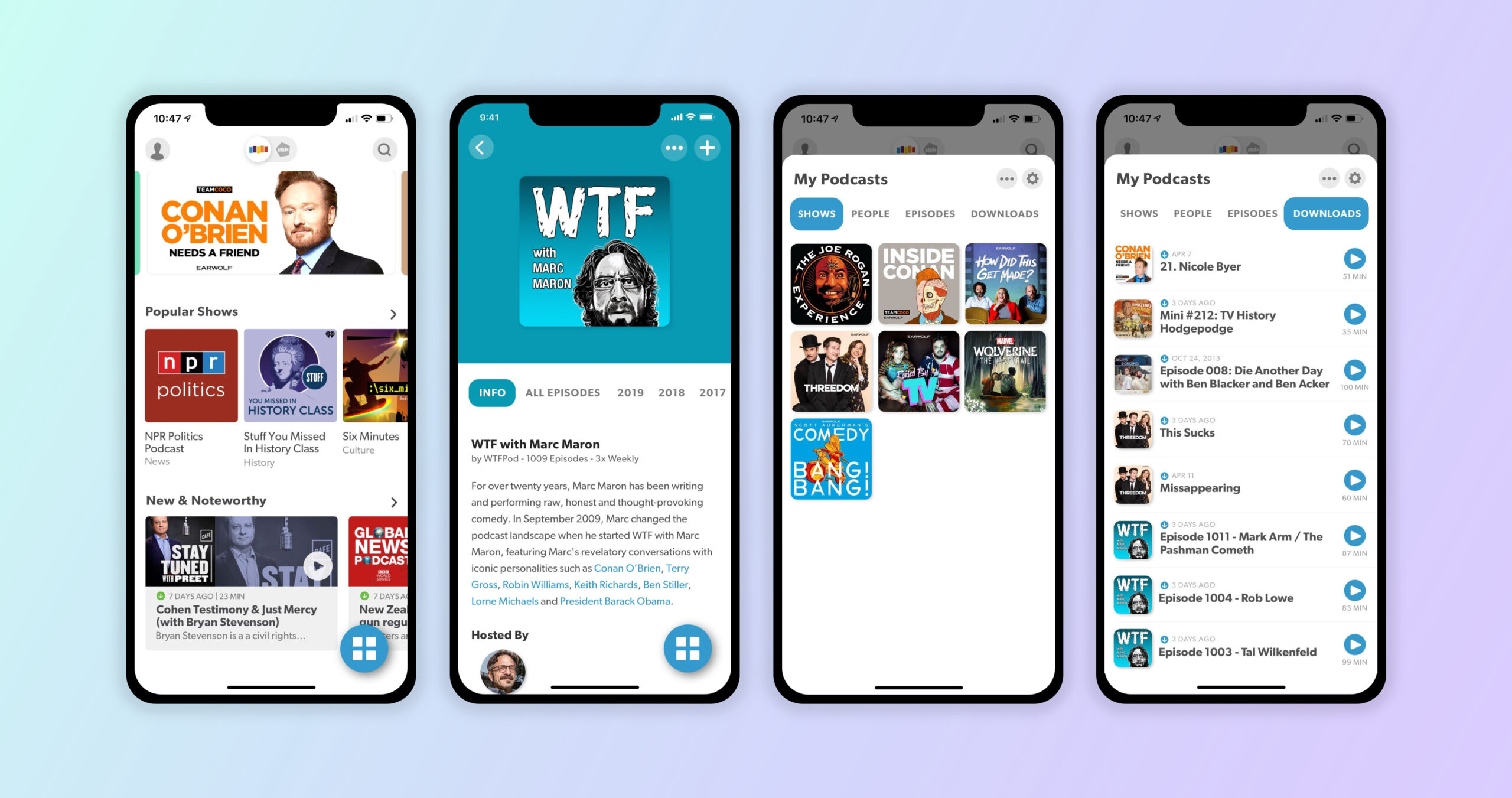
Sample screens from our original “Brainz” exploration
Here are a few sample screens pulled from the original “Brainz team” prototype. At the time we were exploring a Home Screen with a toggle in the top center to navigate between regular and premium content. The proposed navigation was an omnipresent vault in the lower right hand corner that the user could tap to view all their saved podcasts, downloads, followed hosts, episodes and more – we lovingly nicknamed this navigation design “the bloop”. Ultimately we would abandon some of these ideas as we tested with our existing users but these were a great jumping off point not only to get conversations started but to excite the broader company as we moved forward.
Research and Planning
To kick off the project we wanted to better understand our users. We began by distributing an email survey to some of our regular active listeners to learn some of their common pain points within the in-market app. At the same time, we began preparing test plans and inviting users to discuss their experiences with the existing product and to offer feedback on ideas we were experimenting with at the time – some were detailed but most were rough ideas. We also began taking weekly meetings with our user support team to gather and aggregate the most common complaints and issues our users were having. Lastly, our team started a regular practice of coming together to discuss our user research videos, sometimes even spending the time doing exercises like empathy mapping.
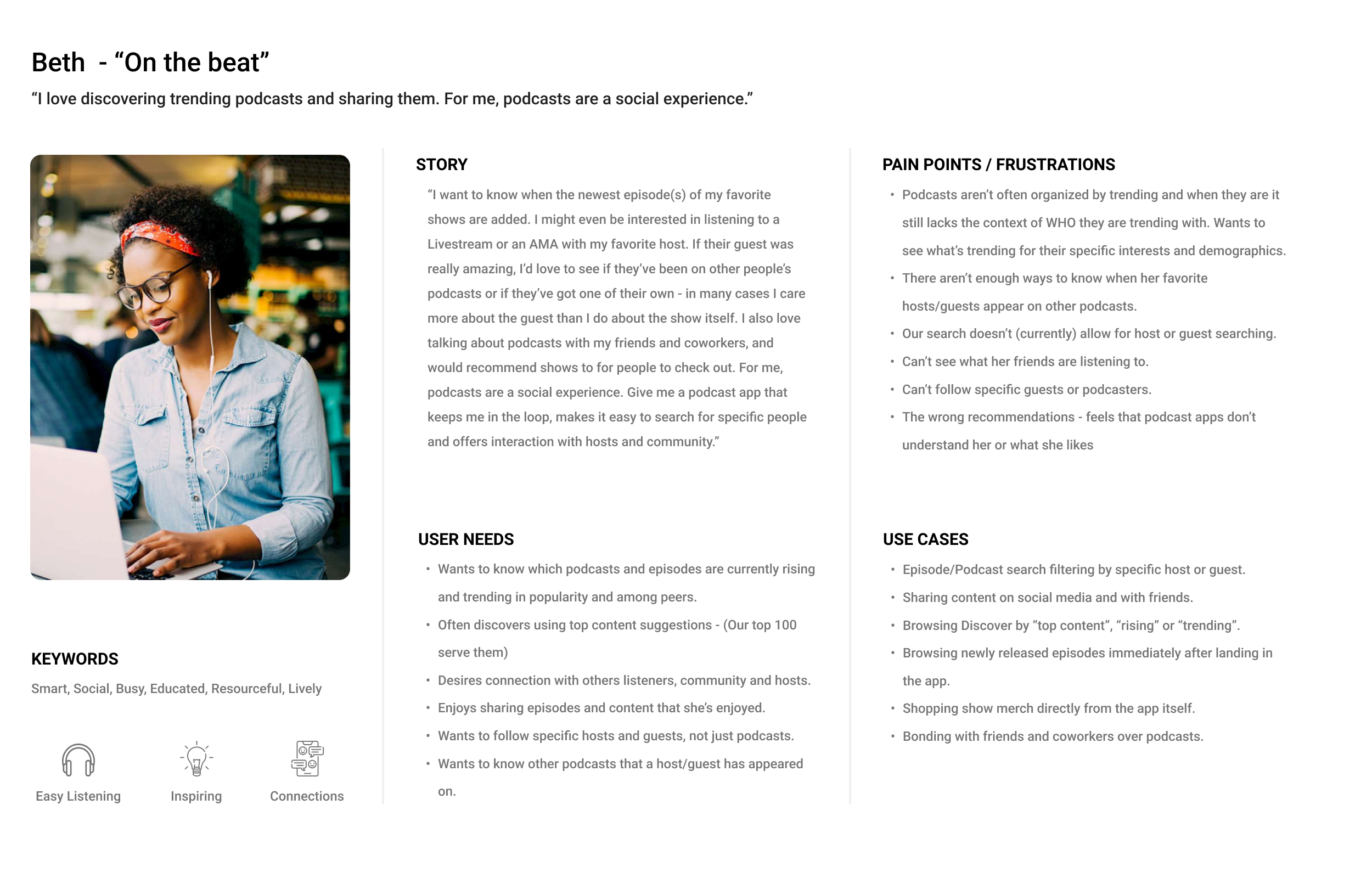
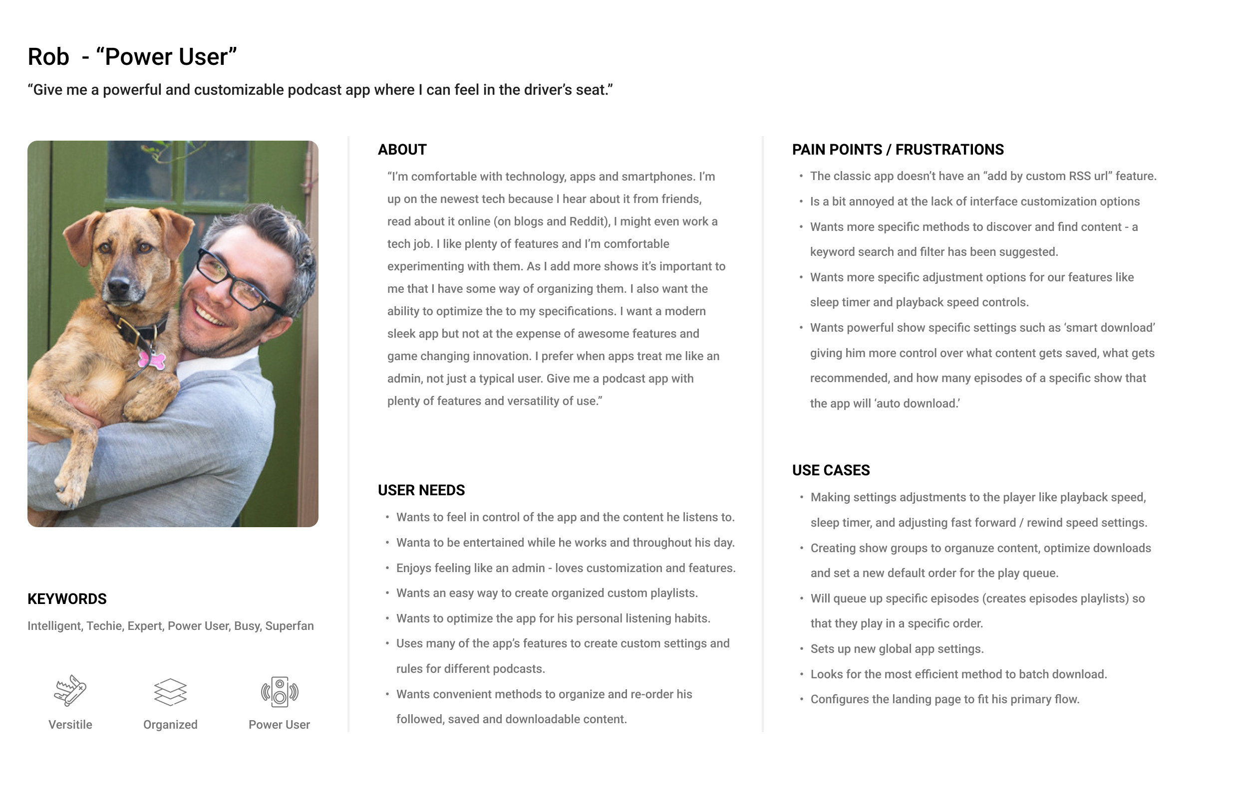
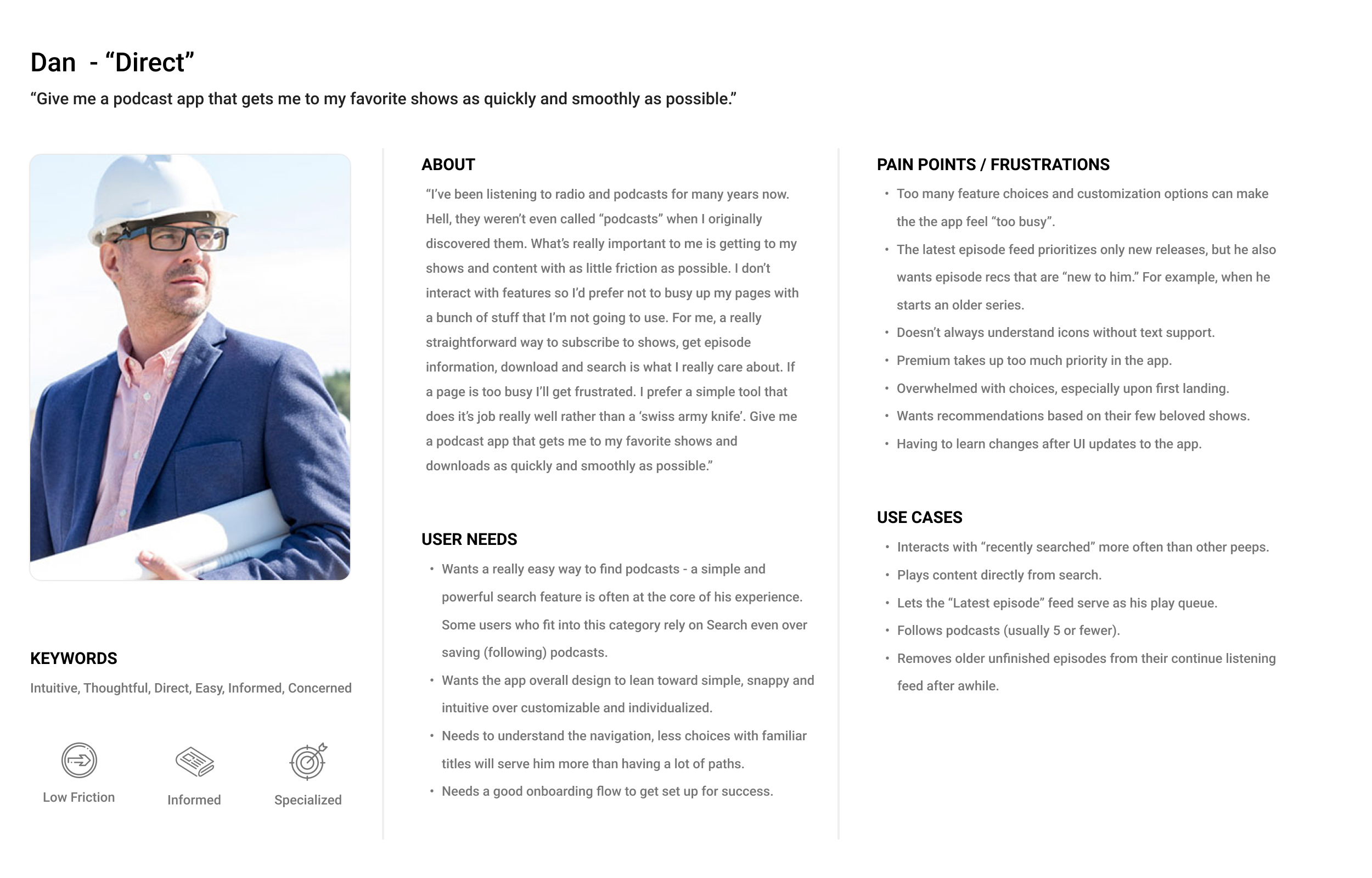
As trends began forming, I created 3 personas to represent a couple of our user archetypes. These artifacts were used to capture common needs, pain points, use cases and listening habits our users were experiencing. These living documents served as reference points for the product team and helped us build empathy for our users throughout the entire design process.
Competitor Analysis
Another area we focused on early in the process was researching and using our competitor’s products. We did exercises like asking 2-3 person (internal) teams to try competing products for a week while tracking their experiences and sharing feedback. The design team also independently familiarized themselves with the competing products.
Our findings were captured in a shared document that the team could reference at any time. These included screenshots, feature lists and comparisons, our personal feelings/experiences with the app(s) and select user quotes. We researched a broad list of competing products on both iOS and Android including: Apple Podcasts, Google Podcasts, Spotity, Pandora, Castbox, Castro, Pocketcasts, Himalaya, Podcast Addict, Overcast and more.
This was a really valuable step for us, it gave the product team and our engineers a much deeper understanding of the podcast universe. We learned how other apps were approaching their IA and structures, industry trends, which features users seemed to care about, product expectations, rules, and even common vernacular. It provided valuable insight that made the entire design process significantly easier.

Testing Strategy
An ongoing part the entire process was validating our designs and ideas with moderated usability testing. Our testing was generally performed in person or through zoom using simple prototypes of various levels of detail. The majority of our prototypes were built using tools like InVision or Figma. As a rule, we went into each testing session with a set of questions or assumptions we wanted to solve for to keep the conversation focused. One of the things I learned early in the process was that I got better feedback when I did shorter, more focused tests rather than trying to walk the user through many prototypes and lots of feature ideas all at once.
Typically I tried to conduct most testing on Tues-Thurs to give time to prepare a quick readout on Friday.
Designing a Solution
Information Architecture
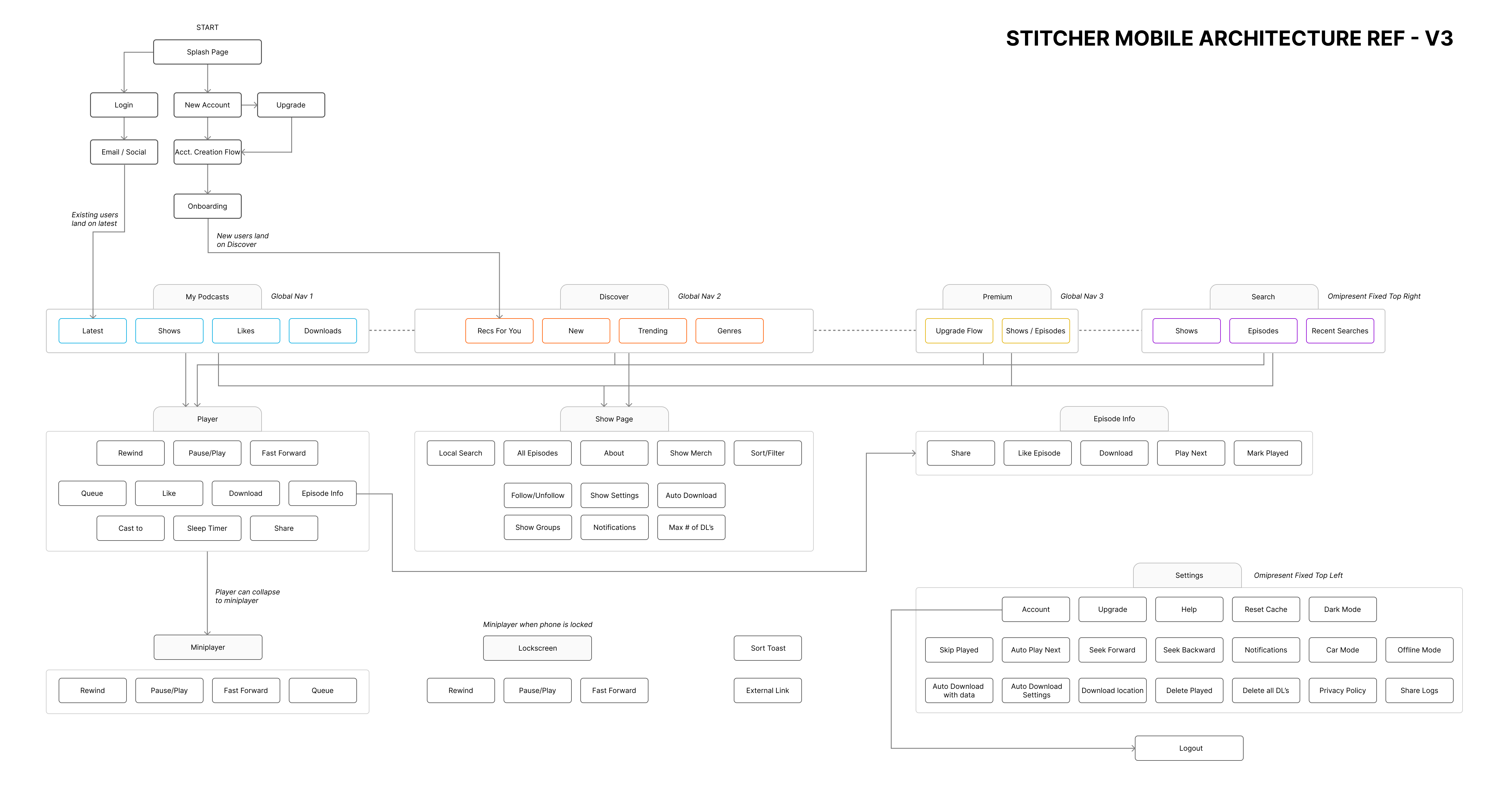
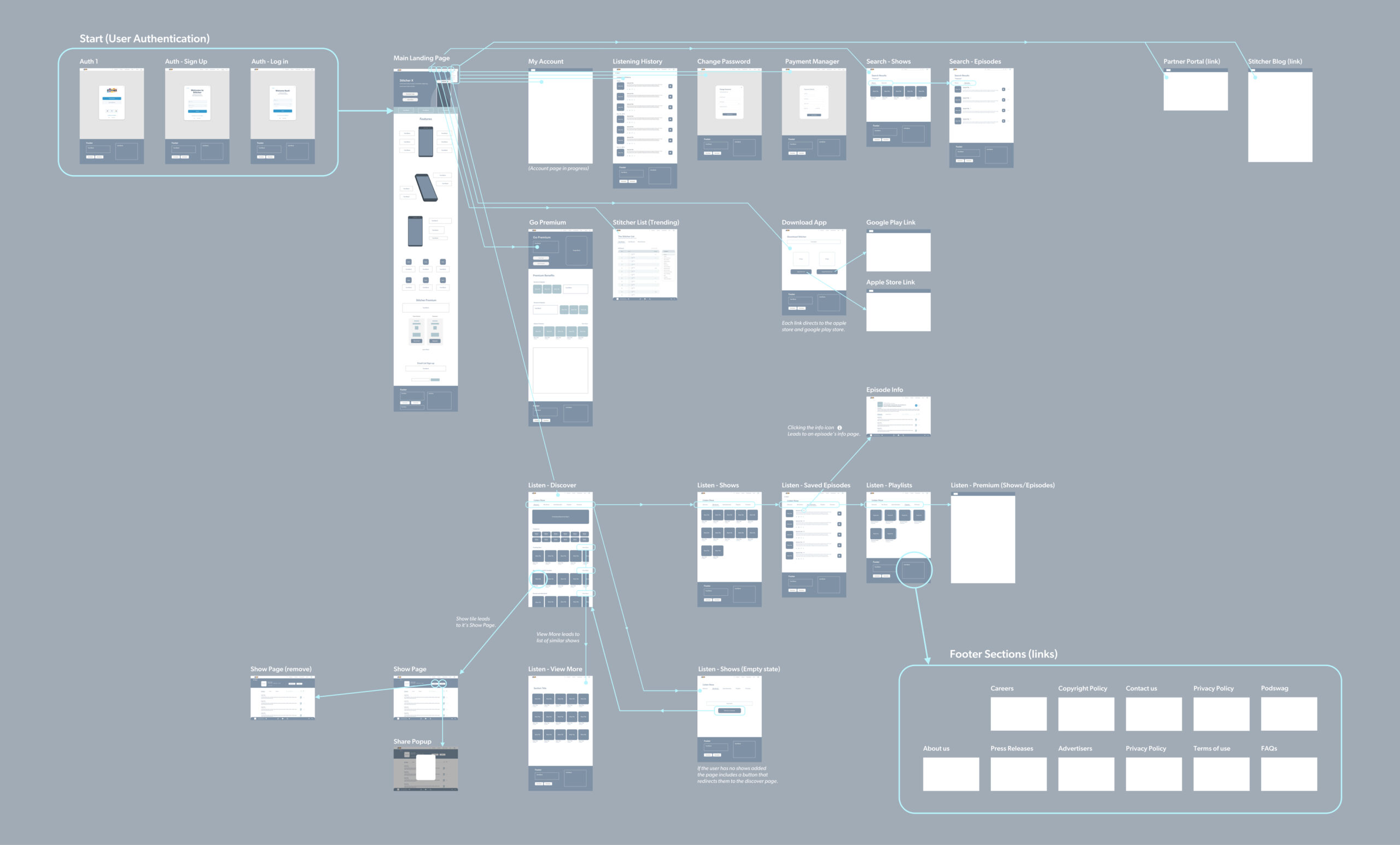
Our user research uncovered pain points that we needed to address in our overall app design. Based on the feedback we felt that it was important to simplify our navigation by breaking down the main sections into saved/downloaded content, discovery, search and settings. Ultimately we also separated Premium into it’s own dedicated section as well due to requests from leadership and marketing. We explored and tested a few different navigation structure but this featured IA structure was the most intuitive for users. We also created a new IA structure for our website so that we could offer a better listening experience for users online and give marketing a place to promote the new app.
User Flows & Journey Mapping
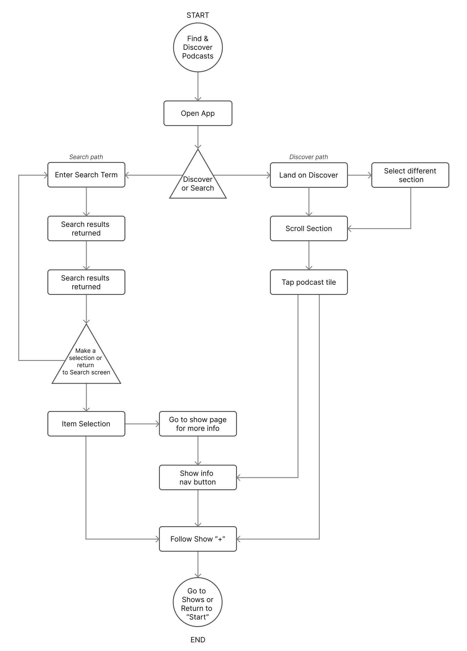
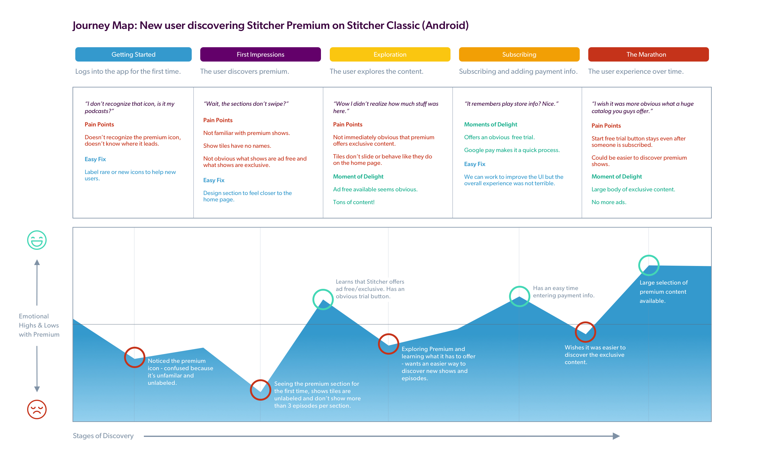
As we worked on the architecture and designs we also wanted to better understand how users were interacting with both our “in market product” and our test builds. We created various user flows and journey maps to capture their flows and to map their pain points / delights were visually represented and sharable.
Wireframing
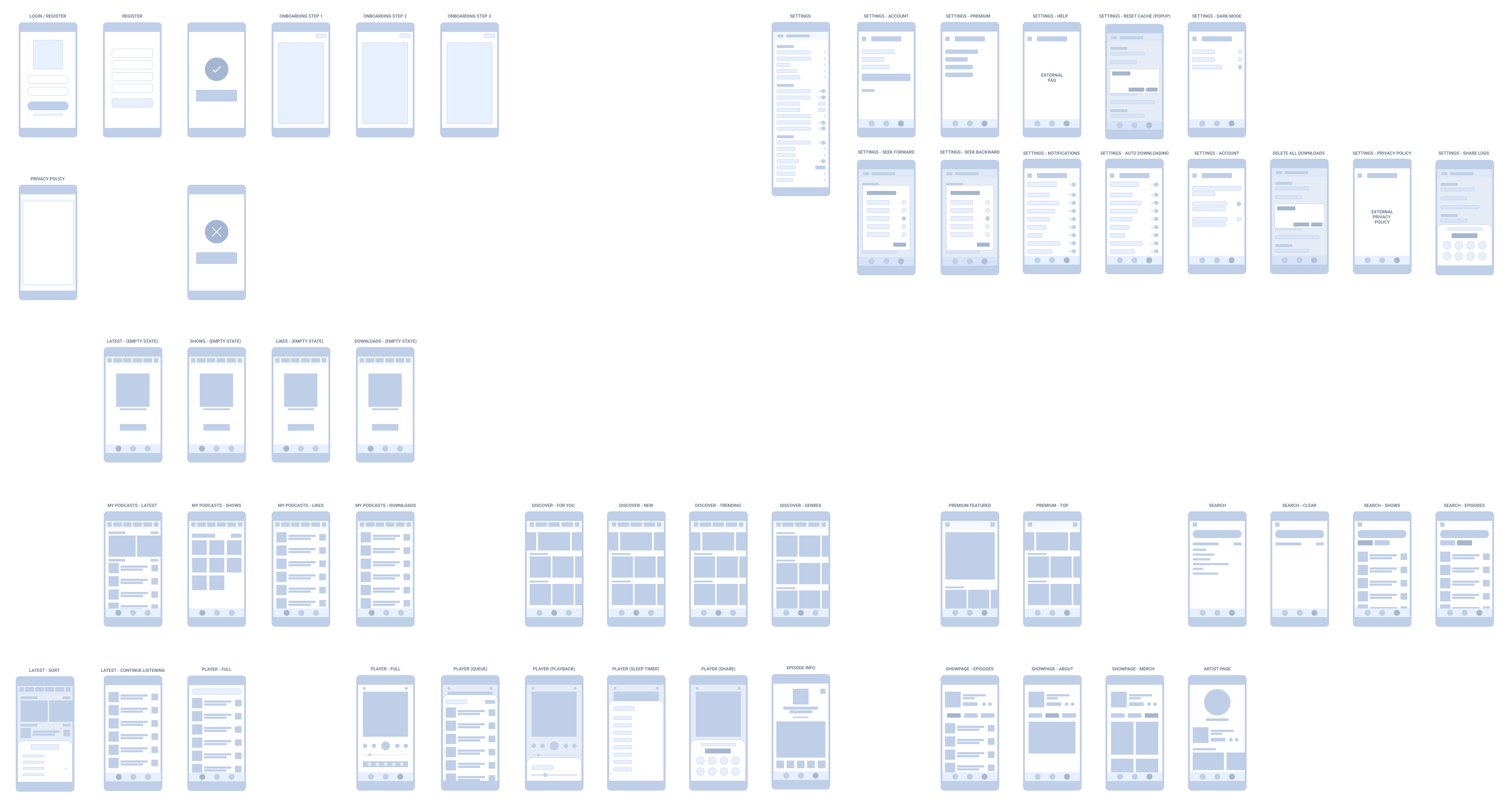
Wireframes were an ongoing part of our design and testing process. Creating these quick, low fidelity mocks let us test and validate whether the designs were working in their simplest form. Often, if we wanted to work out ideas or features before moving into higher fidelity designs we would first wireframe them. Most of our testing was actually done with more detailed mocks because, at the time, we felt that it gave a more accurate representation of the app’s UI – especially once we started to feel more confident with the structure. If I were to doing this project again I would have tested earlier in each design sprint with simple wireframes to save time.
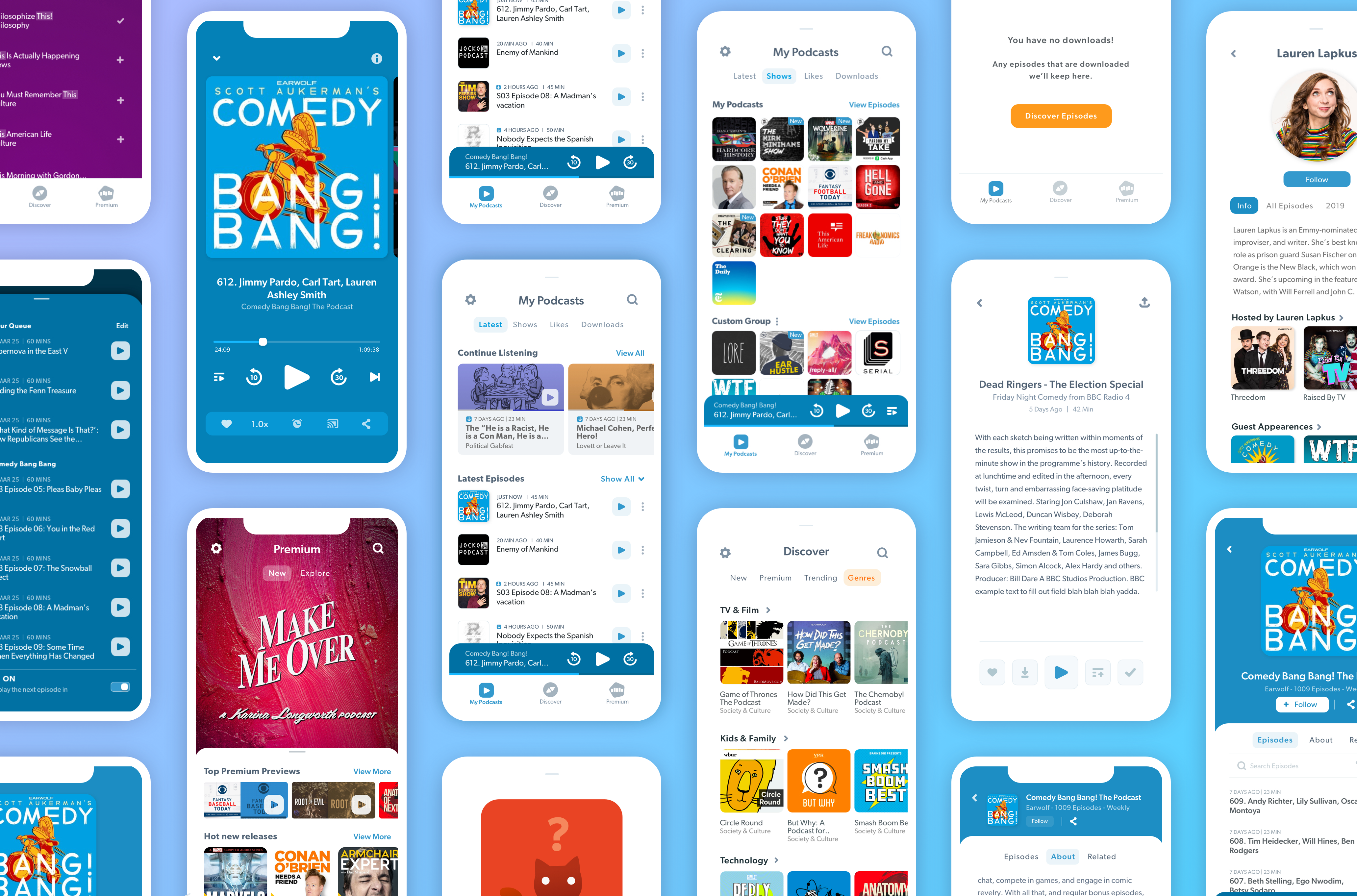
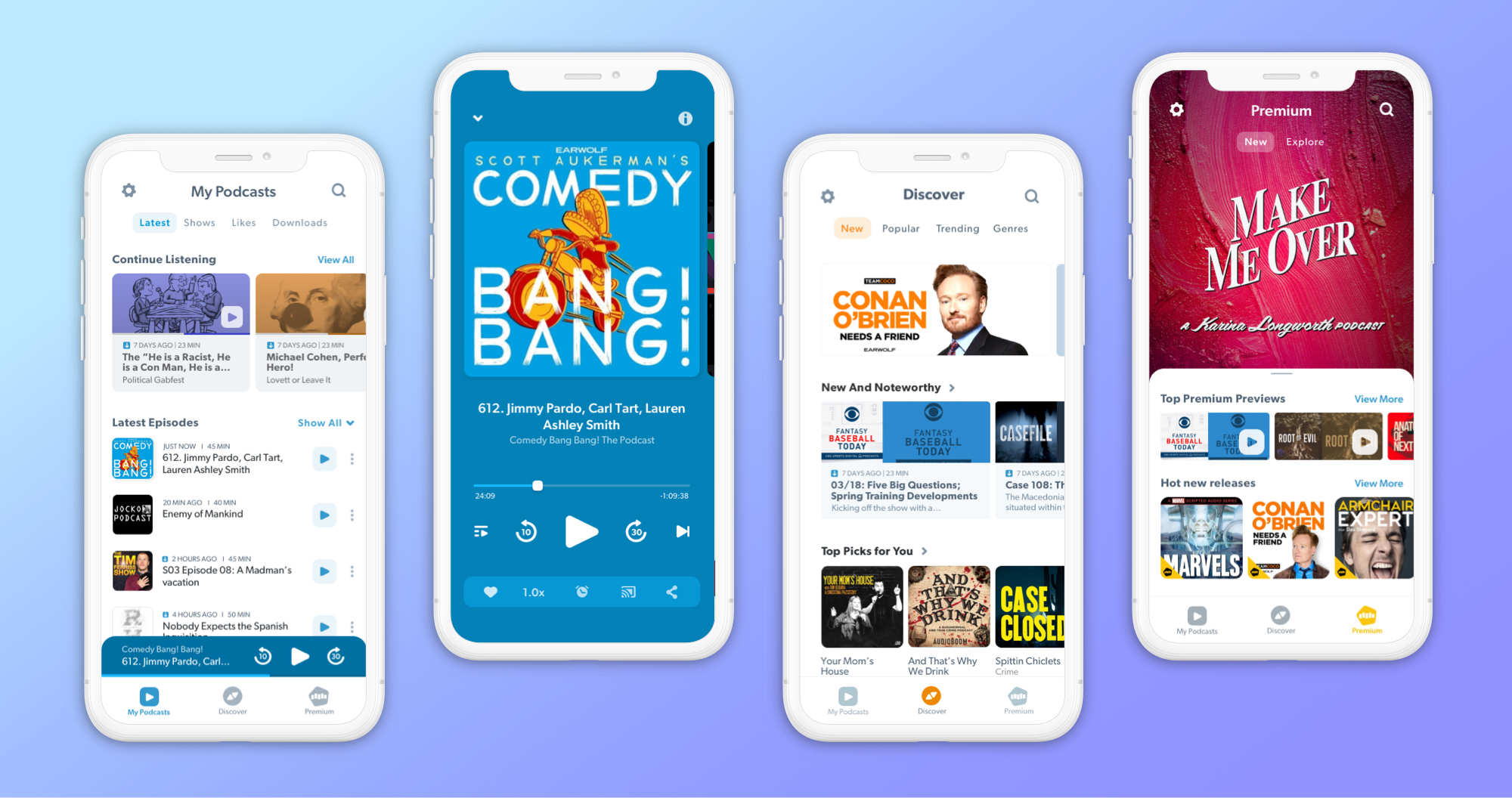
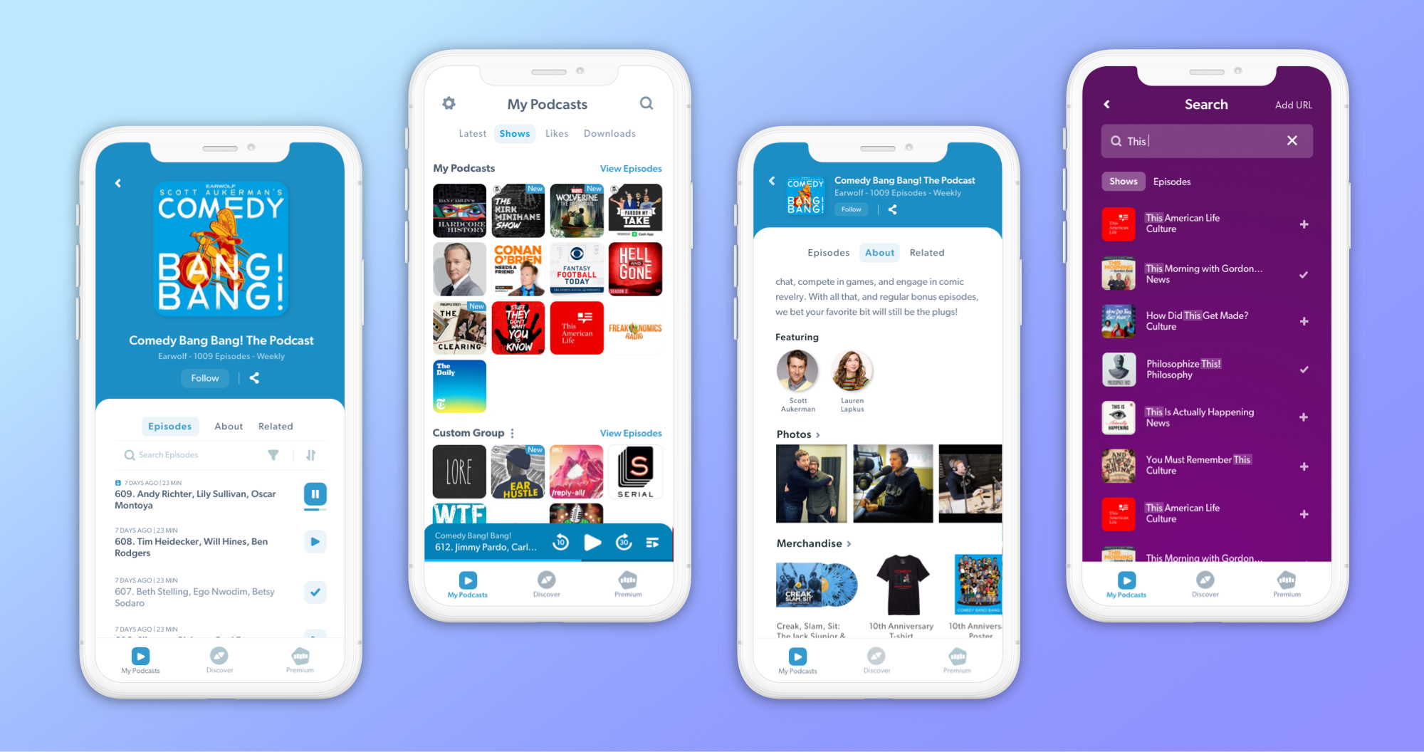
High Fidelity Mocks
Here are screenshots from our high fidelity designs and in market app.
User Migration
With a completed product and a backlog of designs at the ready our team migrated the users onto the new experience. It was bumpy at first since it was a lot of change and a lot of opportunities for bugs. But, ultimately the migration was successful for both iOS and Android. The team continued to work on the backlog of features and design idea follow ups post launch like UI updates, dark mode and more.
The Outcome & Next Steps
Throughout this project our small team would explore a variety of design directions, styles of navigation, architecture, feature ideas, layouts and more. Ultimately, we successfully shipped a brand new podcast app on a powerful new backend, launched a completely re-designed website, and the project continues to grow and improve to this day.

