UX/UI Case Study: Skybound Mountain Climbing App
REI Mountain Project – Mobile App Redesign
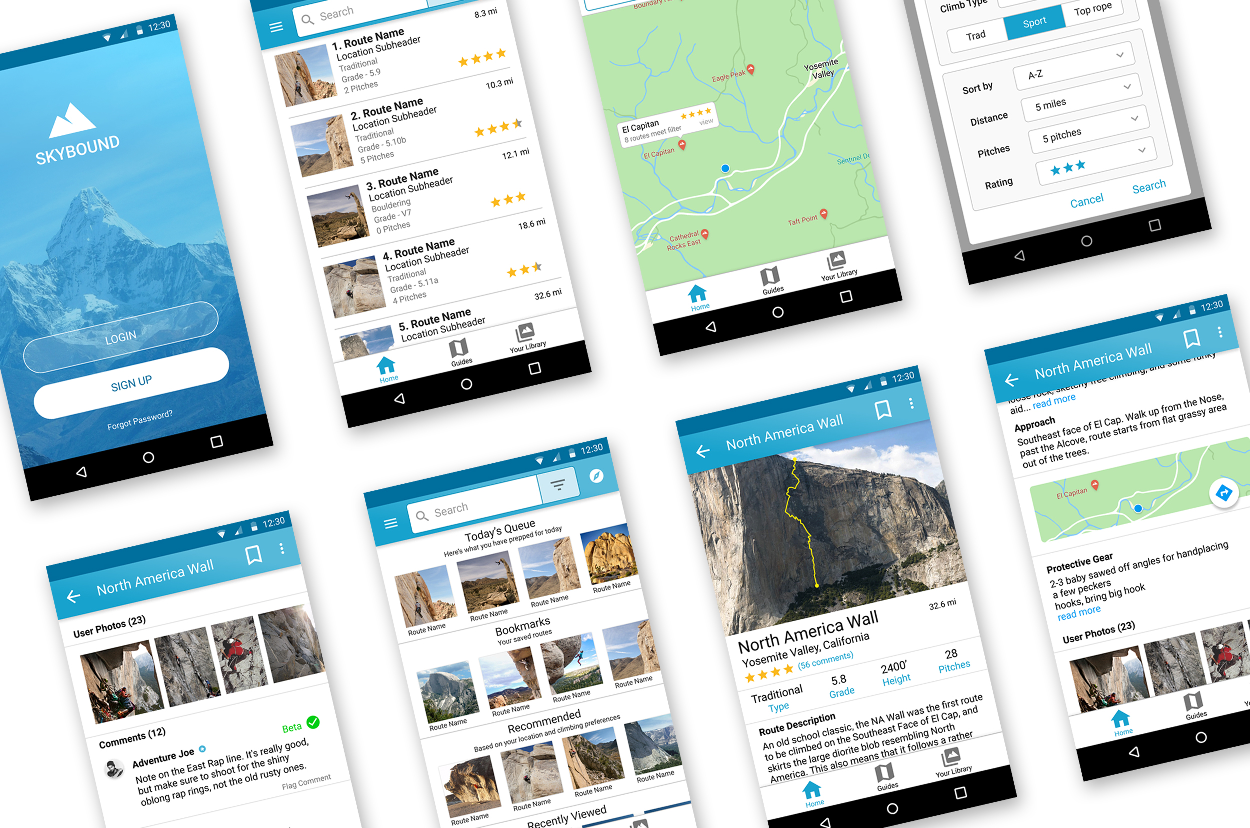
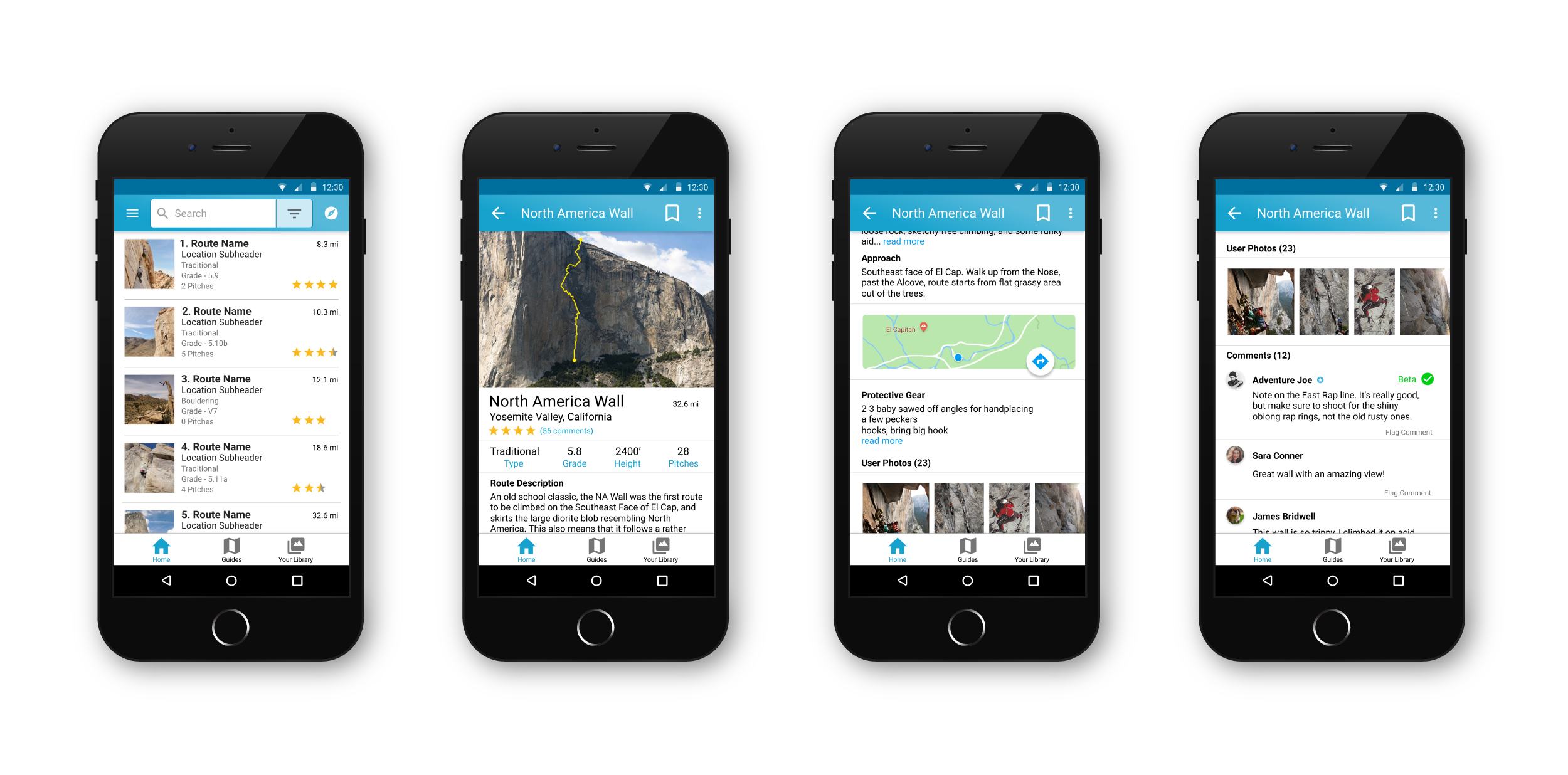
The goal of this project was to redesign REI’s Mountain Project app to improve the user experience for it’s users: outdoor rock climbers. My aim was to identify areas where users were running into problems while navigating the app, add features, redesign the app’s UI to be more appealing and most importantly I wanted to re-design the interface to make it a more intuitive, personalized and an overall more enjoyable interaction for the users.
The Challenge
My challenge was to take this extremely in depth app like and make the interactions much more natural and enjoyable for the users. To accomplish this I conducted extensive interviews, user testing and continually refined my designs based on feedback and data that I was collecting.

Hueristic Evaluation
First, I started by analysing the existing app to identify key problems and issues that stood out to me. This was compared to online reviews on Google Play and the App Store.
Competitive Analysis
Next, I compared 3 of the most popular apps to REI mountain project, read the full list of reviews from the app store and tried out each of the apps for myself.



REI Mountain Project App
My Climb App
Rakkup App
The REI Mountain App contains a tremendous amount of useful information but has numerous design issues that cause trouble for the users.
- Needs a new home page that’s more personalized for each user.
- The app should allow users to download one individual route rather than a whole state.
- The navigation needs a complete overhaul.
- Route beta should be better organized and easier to find.
The MyClimb app seems more focused on gym climbing, training, and has a pretty well designed social aspect that allows it’s users to track their progress, compete with other users and share their progress.
The app is not designed for outdoor routes. It does not provide sufficient beta or climb information to it’s users, nor does it provide gear recommendations.
The app allows users easy access to official guidebooks from their mobile devices, has a solid gps and allows users to add custom beta notes.
The UI needs a bit of an overhaul and doesn’t contain the massive library of information that users get from Mountain Project.
Sketching and Low Fidelity Mock Up Ideation
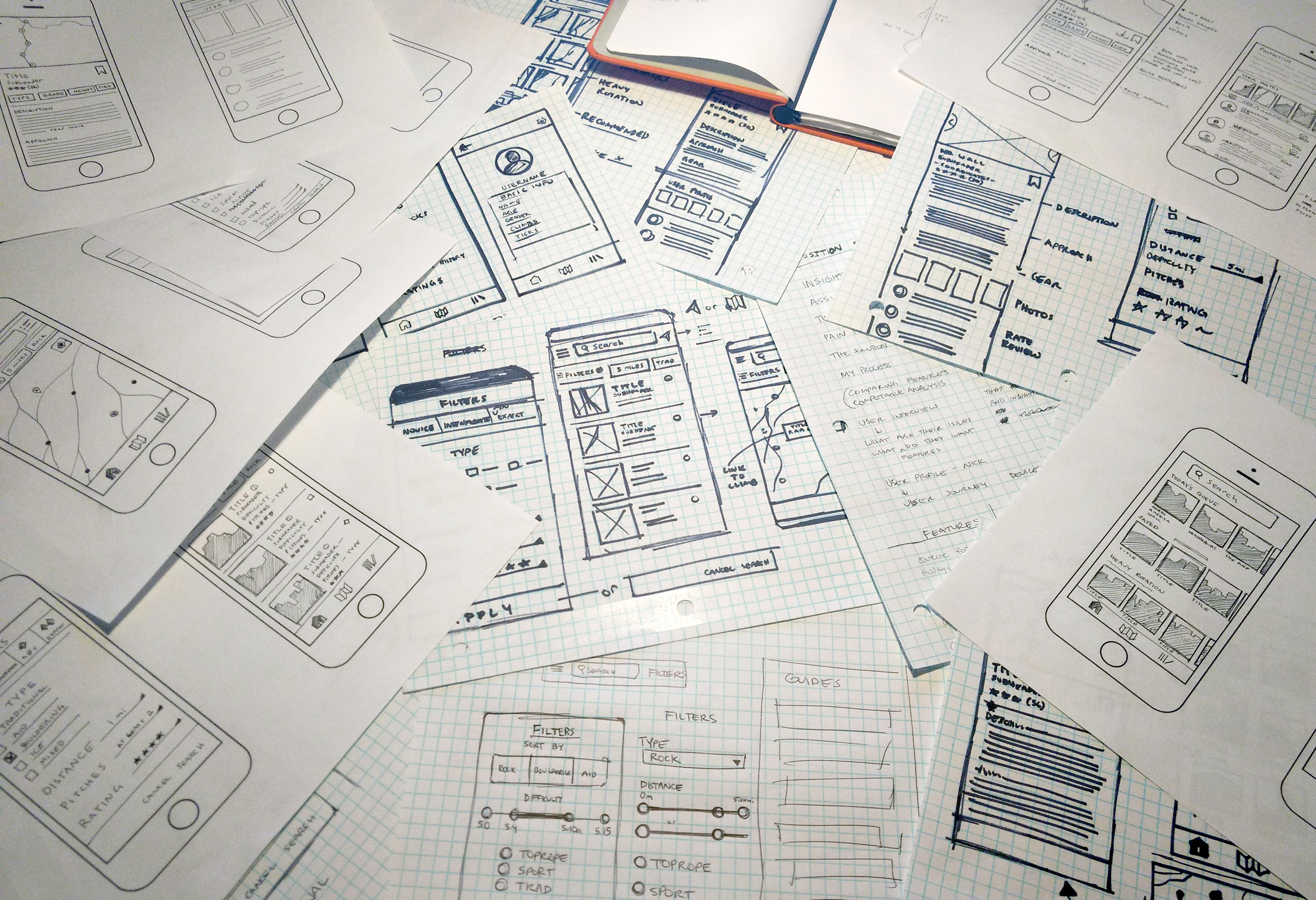
At this point I began sketching ideas and starting to get some stuff down on paper. My sketching process begins in the very early stages of the project and I continue to develop ideas and sketch things out until they work well on paper and it’s time for the high fidelity UI designs.
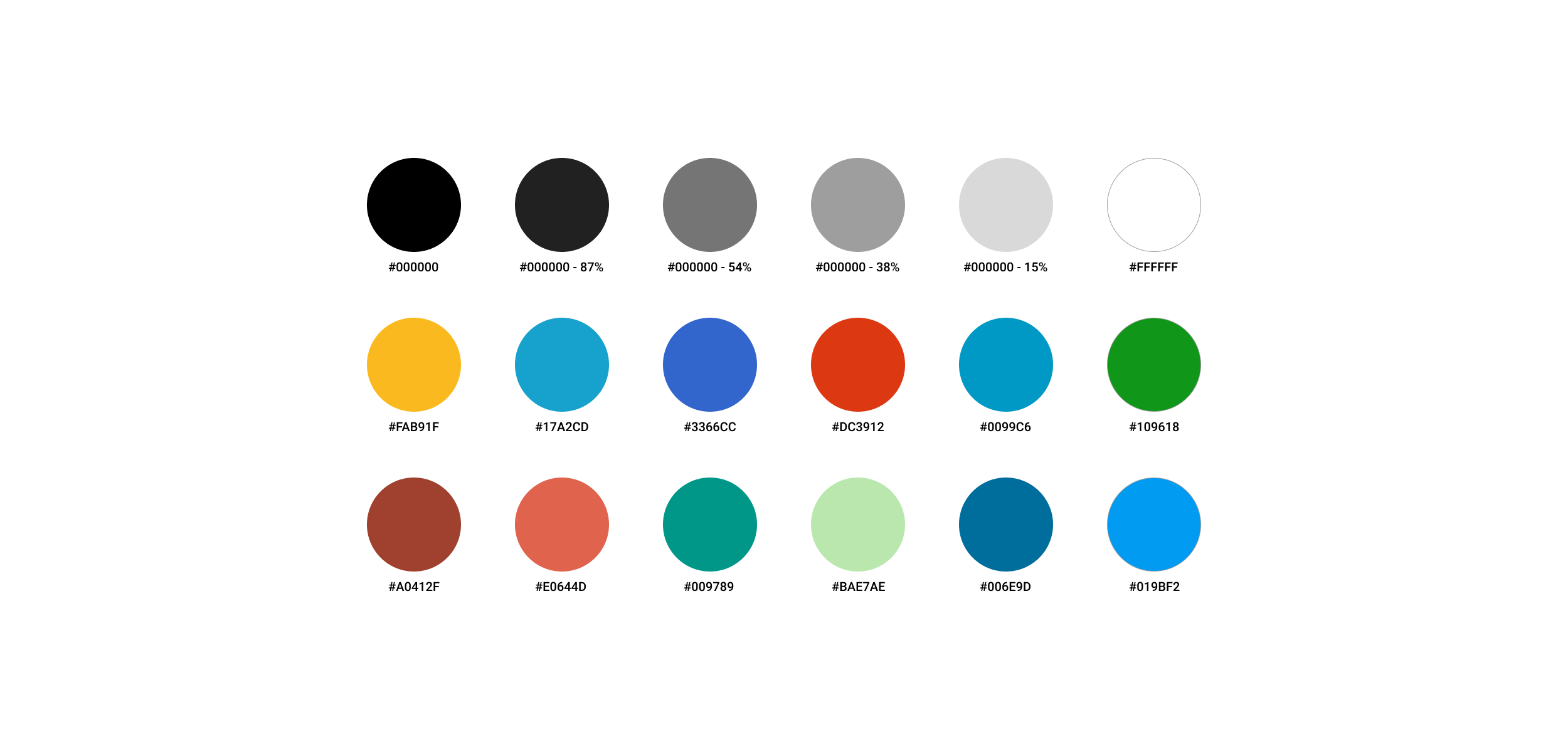
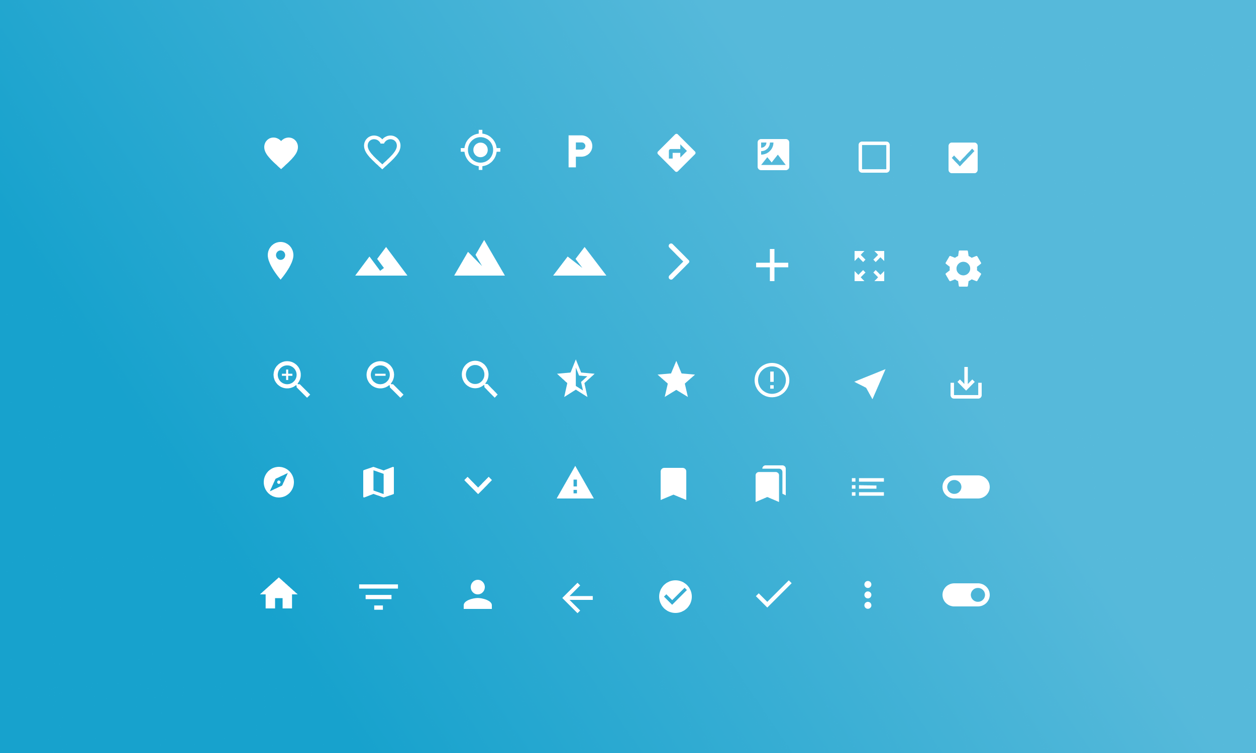
UI Color Palette and Interface Icons
Contextual Inquiry / Field Study
While working on this app design I took a trip to the climbing gym every day and also planned out a climbing expedition to Yosemite National Park using the current REI Mountain Project app. I was assisted in the trip planning by a good friend who is also an exceptional rock climber.
While at the climbing gym I spoke with a number of climbers at the Touchstone climbing gym’s in Berkeley and Oakland, CA to see if they are familiar with the Mountain Project app and what their experiences have been like. This lead to a number of insights and helped to direct my questions for the surveys and helped develop my design ideas.

Surveys + User Interviews
I conducted 18 short interviews with local climbers, some who were familiar with the app and a few that were navigating it for the first time. I also conducted 3 lengthy interviews (1-2 hours) with users (climbers) that I already knew well. The data collected from the interviews helped me get a really good idea of the user’s pain points, what features they’d like to see gave me enough data to build user personas.
Pain Points
The interviews revealed a number of pain points that the users were dealing with. These are the most common themes:
- You can’t download individual areas, instead you must download an entire state at a time- all or nothing. And that takes a huge amount of memory.
- Going back and forth among different sub-areas can be frustrating if not intimately familiar with the interface.
- The navigation is tricky to learn.
- When searching, all you get is a list of the routes in an area but have no way of identifying them.
- The app should be more personalized, I want my homepage to show saved climbs and offer recommendations.
- Beta should be easier to identify. It should be organized separately from user photos and comments or given beta flair so it’s easier to spot.
User Personas
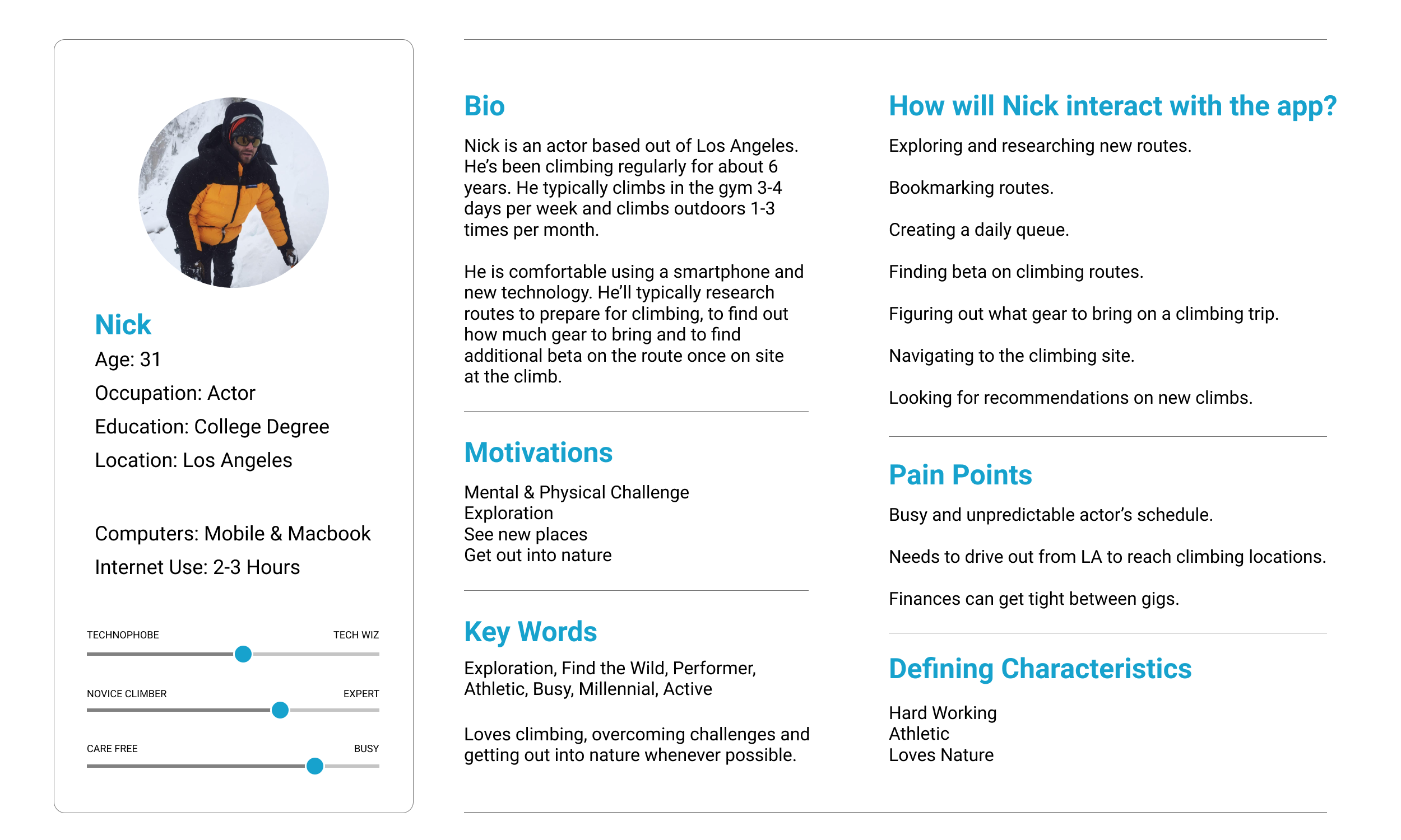
Nick represents the majority of users who I spoke to who were using the app. The majority of active users I met were in their 20’s-late 30’s. They were experienced climbers who were on the wall about 3-5 times per week, had been climbing at least 2 years and did outdoor climbing at least once every 2 months.
User Journey Map
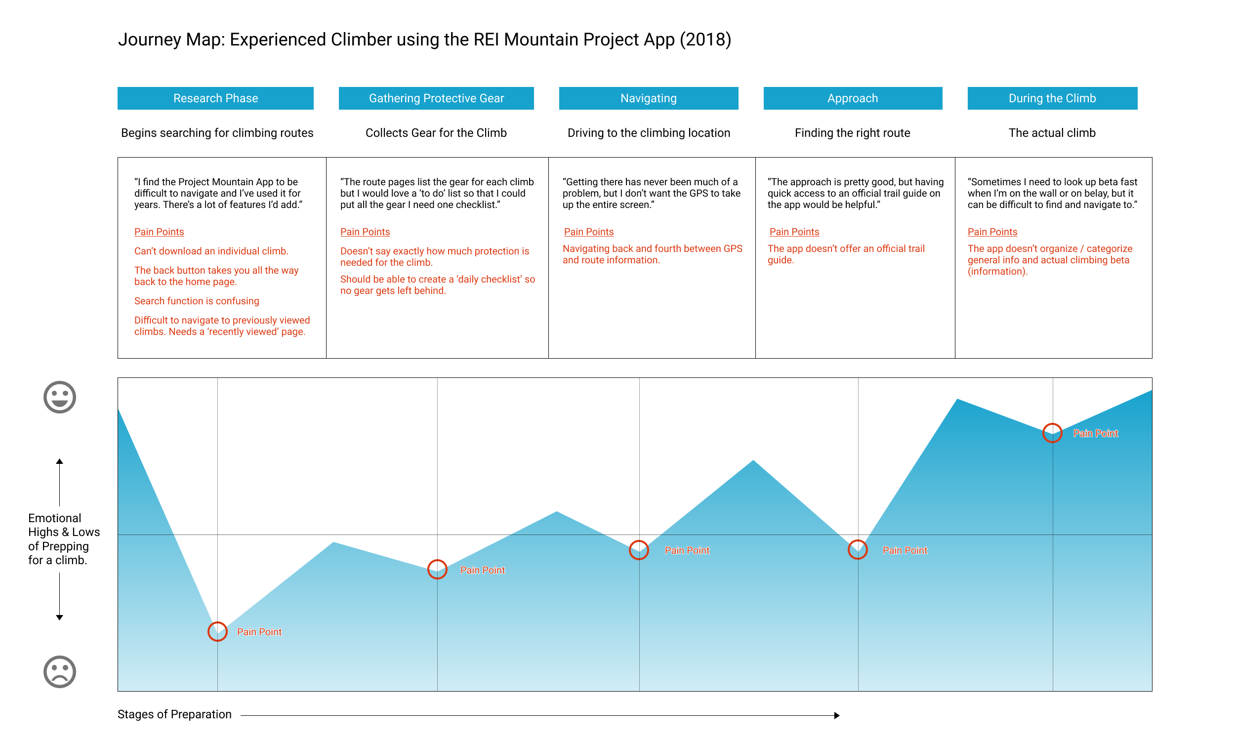
I spoke in great detail with one of the experienced climbers who described the step by step process of how he prepares for an outdoor climbing trip. He described the things he loves about the Mountain Project app, his frustrations, and features that he would like to see implemented into his ideal app.
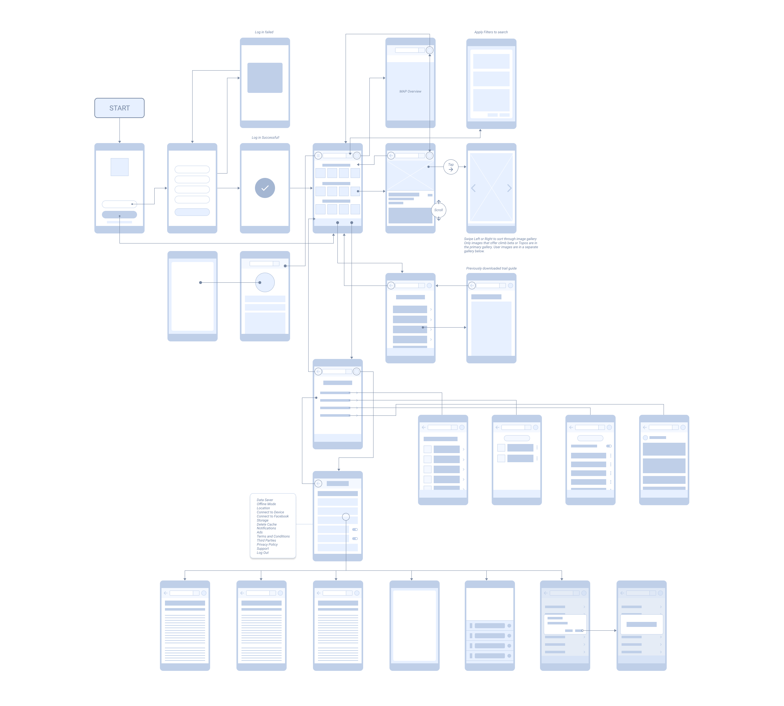
Wireframing the new interaction design
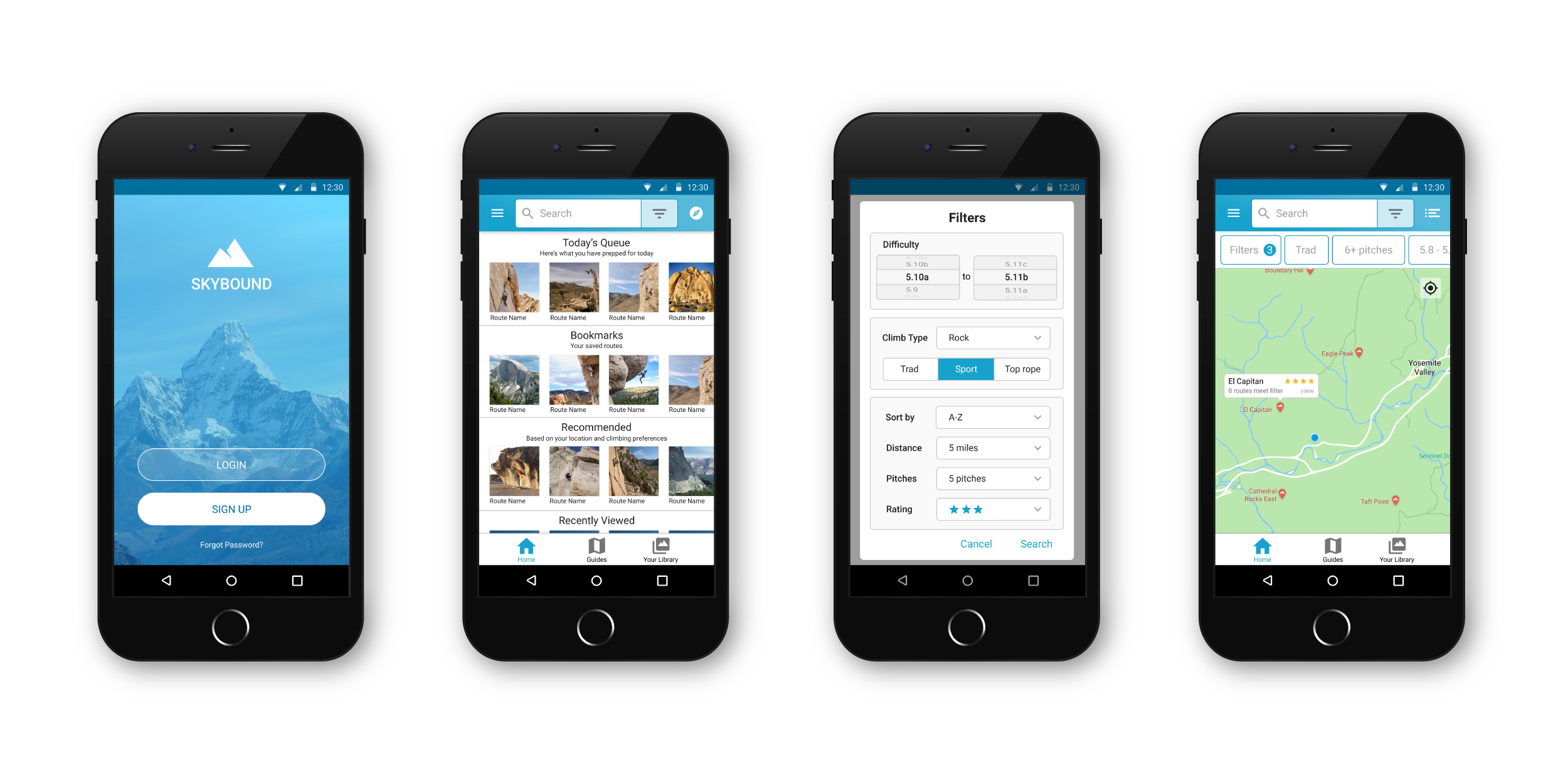
High Fidelity UI Designs
Next Steps
I’m still in the process of building out this app, testing the prototypes with users and developing the designs. My next steps are to continue user testing and to refine my designs even further based on user feedback.

