‘Aurora’ Alarm Clock UI
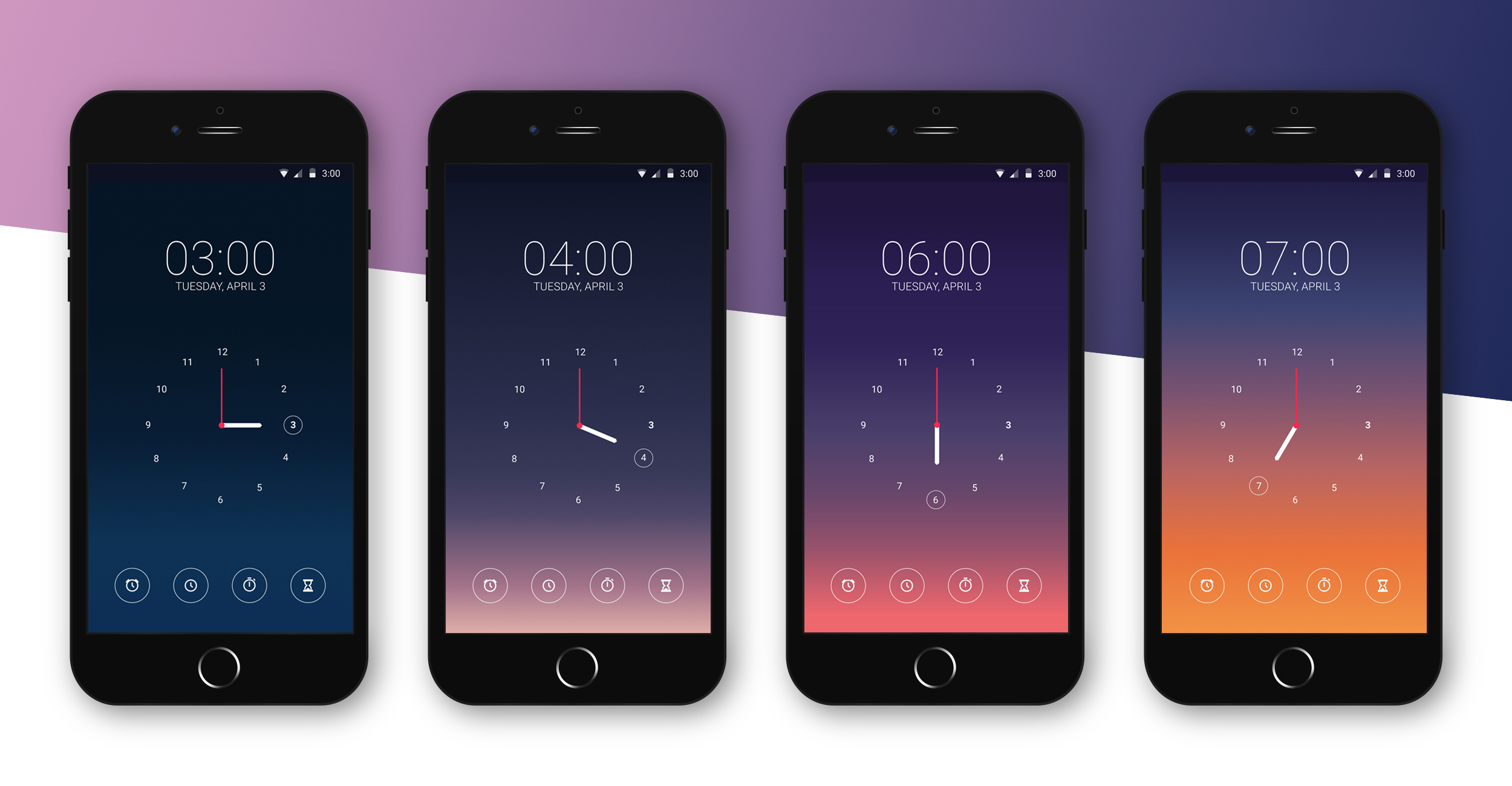
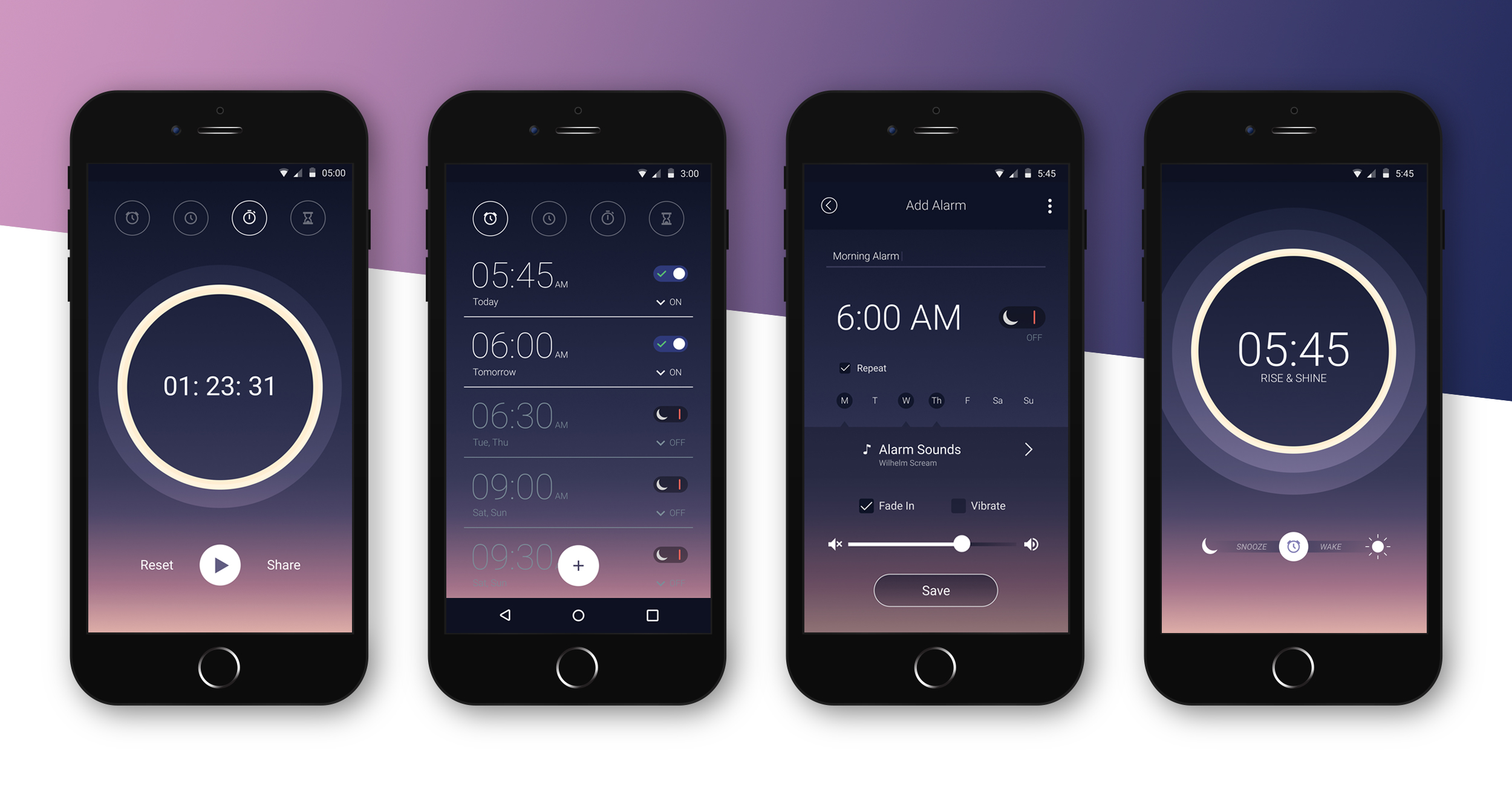
I did this project for a daily UI design challenge. The prompt was to create an alarm clock interface for a mobile device. I wanted to do a colorful design that would give the user an idea of the time of day based on the colors on the screen, not just the numbers on the clock.

Design Goals
Create a calm, centered mood – I wanted the tone of the app to feel calm and tranquil, like meeting the sunrise with yoga or meditation.
Mimic the brightness and colors of the sky – I wanted the screen of the app to appear darker at night so that it wouldn’t glare in the users face if they checked the time in the middle of the night. I also wanted the screen to get progressively lighter as natural light filled the room.
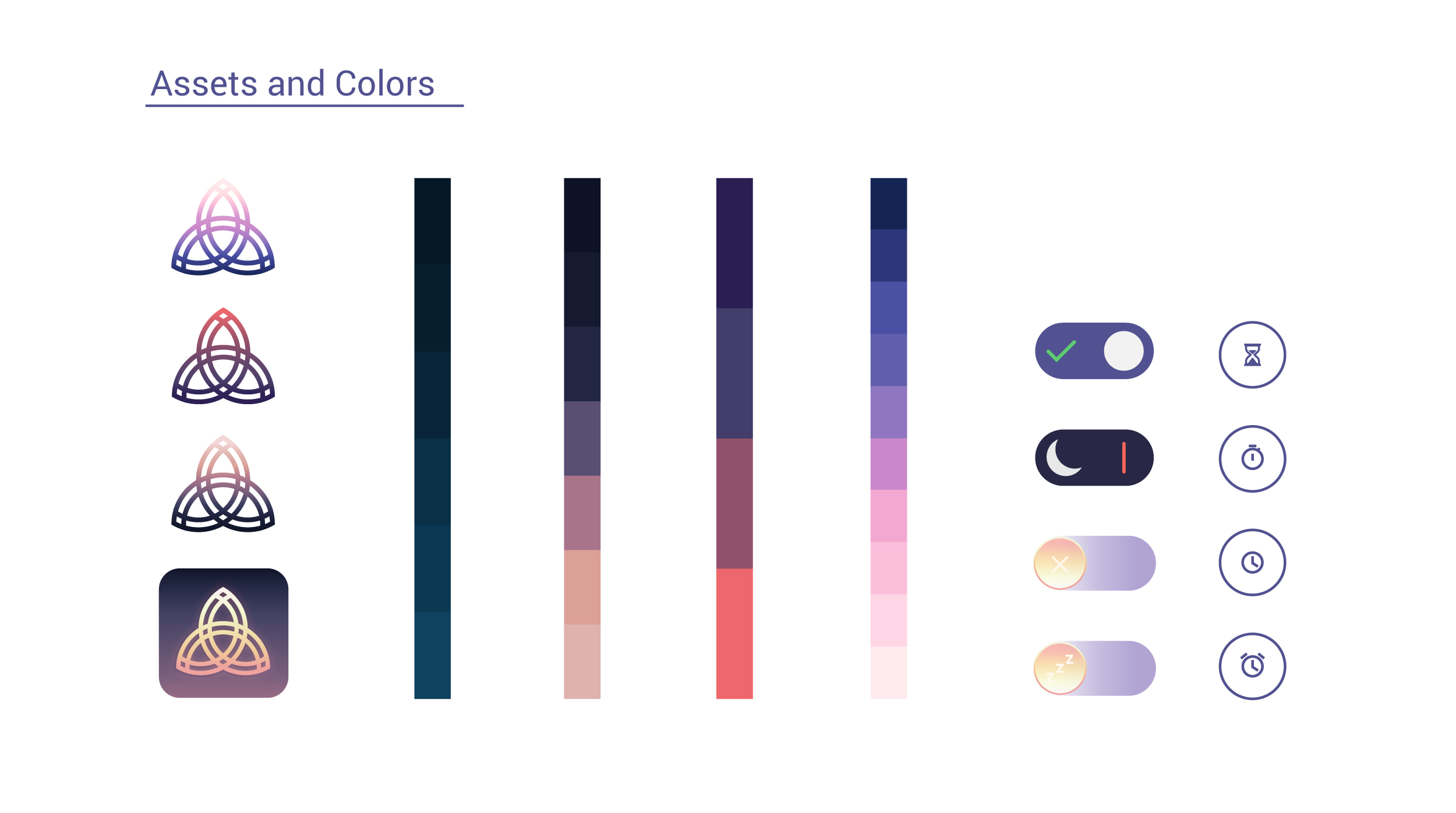
Include Widgets that fit the theme – I wanted to make sure that the app’s widgets fit the theme, like making the “on off switch” look like a full moon and crescent moon.
Does it work when stripped to the basics?
Before getting too heavy into color I wanted to make sure that the app layout would work if presented in the most simple way possible. This pass was meant to strip the design down to basics before getting carried away with colors.

Adding color and detail
I wanted to experiment with a variety of sunrise backgrounds to make sure that the clock remained visible as the sun rose – causing the screen to get lighter. If I were to carry this project further I would have to experiment with flipping the text color to something darker as the sun rose fully or make sure that the daytime colors remained a dark enough blue to keep the white text legible on the screen.


